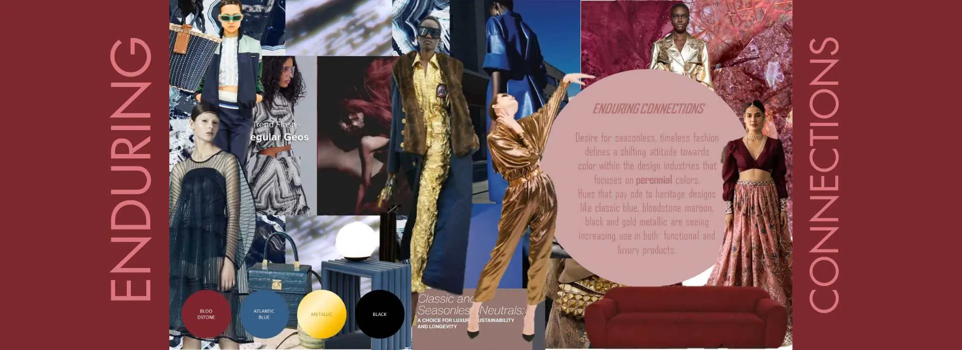
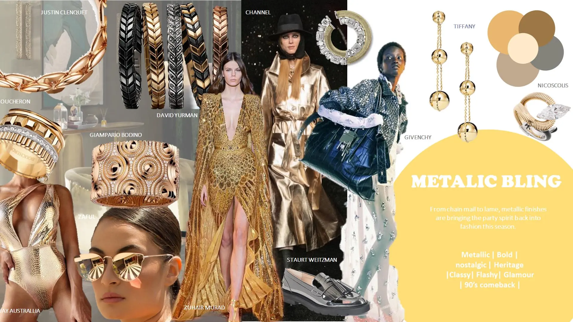
From chain mail to lame, metallic finishes are bringing the party spirit back into fashion this season.
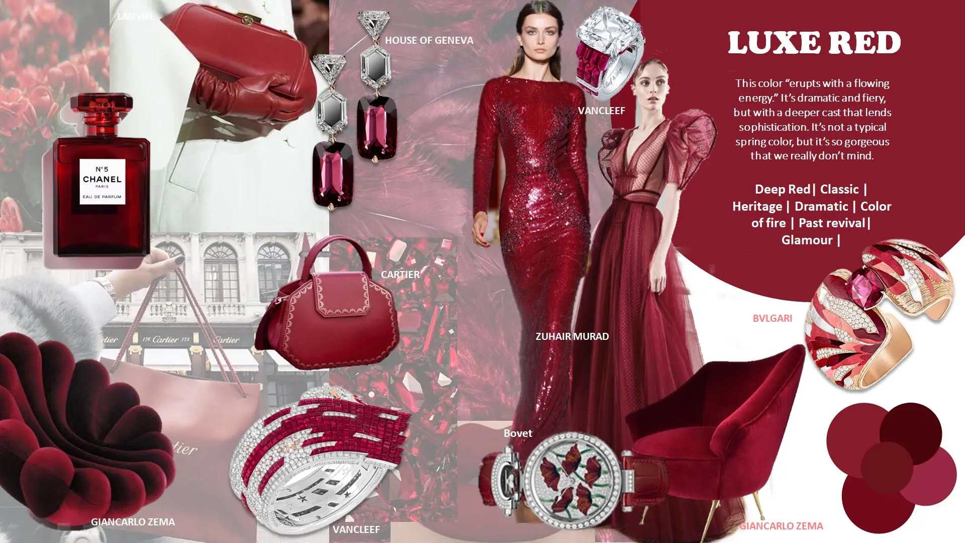
This color “erupts with a flowing energy.” It’s dramatic and fiery, but with a deeper cast that lends sophistication. It’s not a typical spring color, but it’s so gorgeous that we really don’t mind.
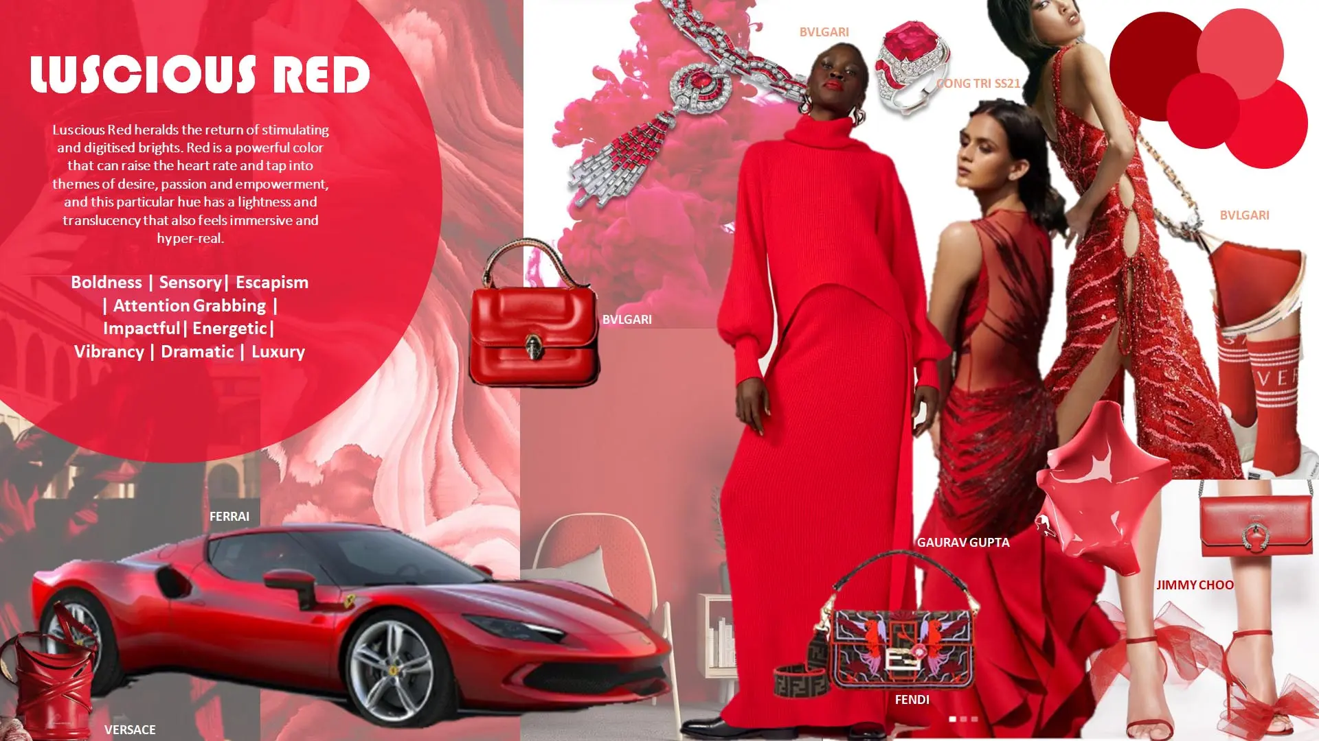
Luscious Red heralds the return of stimulating and digitised brights. Red is a powerful color that can raise the heart rate and tap into themes of desire, passion and empowerment, and this particular hue has a lightness and translucency that also feels immersive and hyper-real.
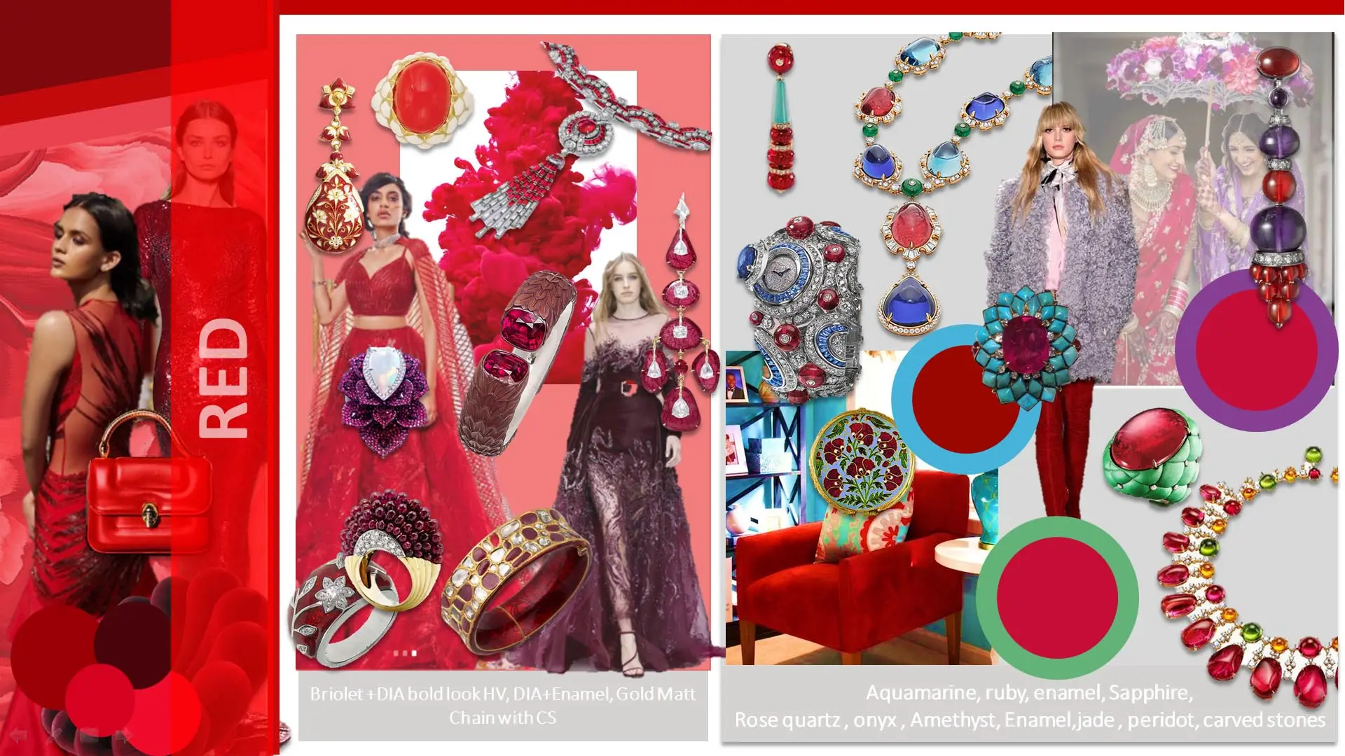
"Discover the latest jewelry trends on our red directional board, showcasing captivating color combinations and cutting-edge materials that are taking the market by storm."
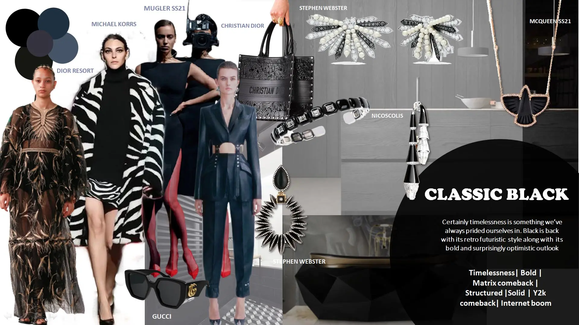
Certainly timelessness is something we’ve always prided ourselves in. Black is back with its retro futuristic style along with its bold and surprisingly optimistic outlook
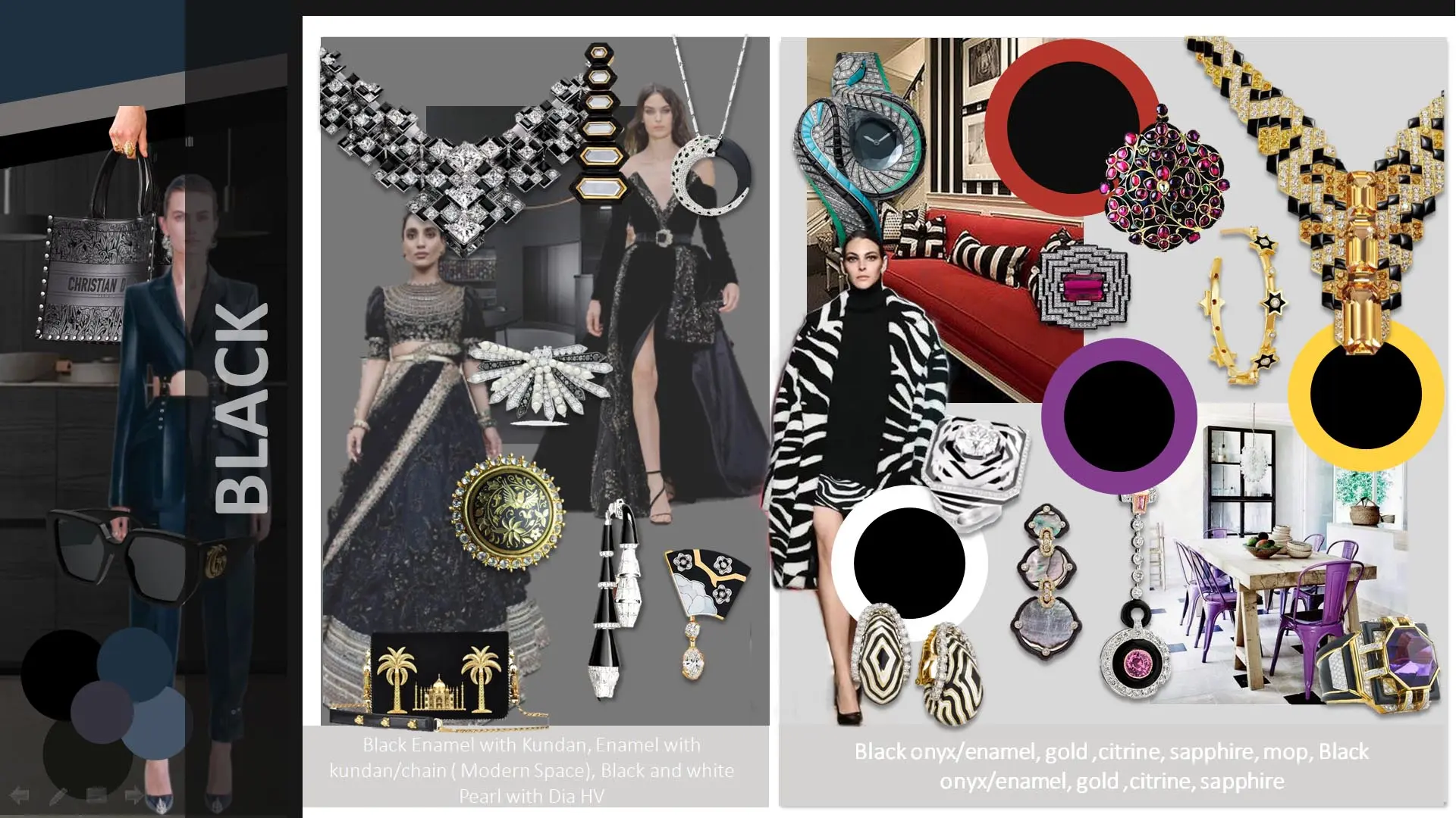
"Explore the future of jewelry fashion on our black directional board, featuring avant-garde color combinations and innovative materials that define today's hottest trends."
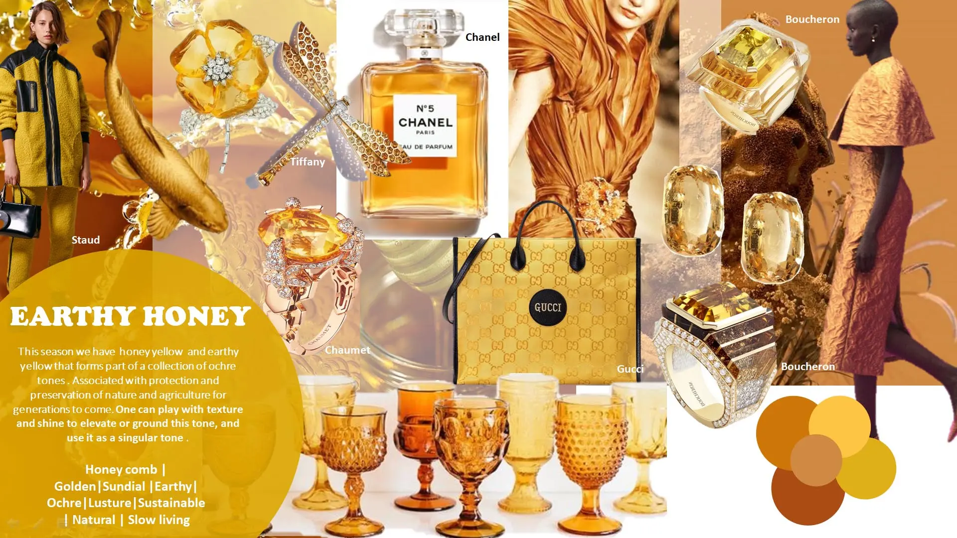
This season we have honey yellow and earthy yellow that forms part of a collection of ochre tones . Associated with protection and preservation of nature and agriculture for generations to come. One can play with texture and shine to elevate or ground this tone, and use it as a singular tone .
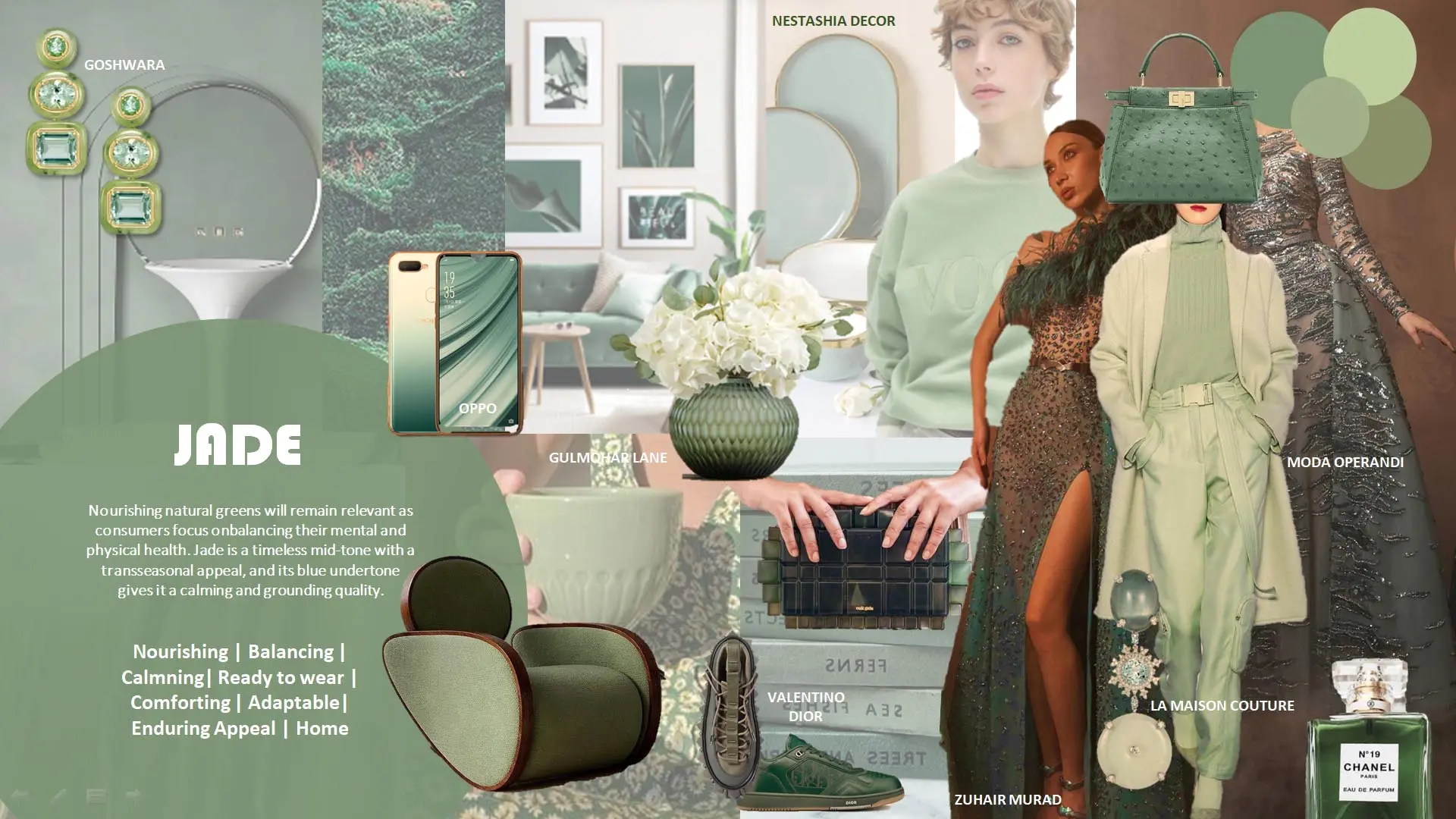
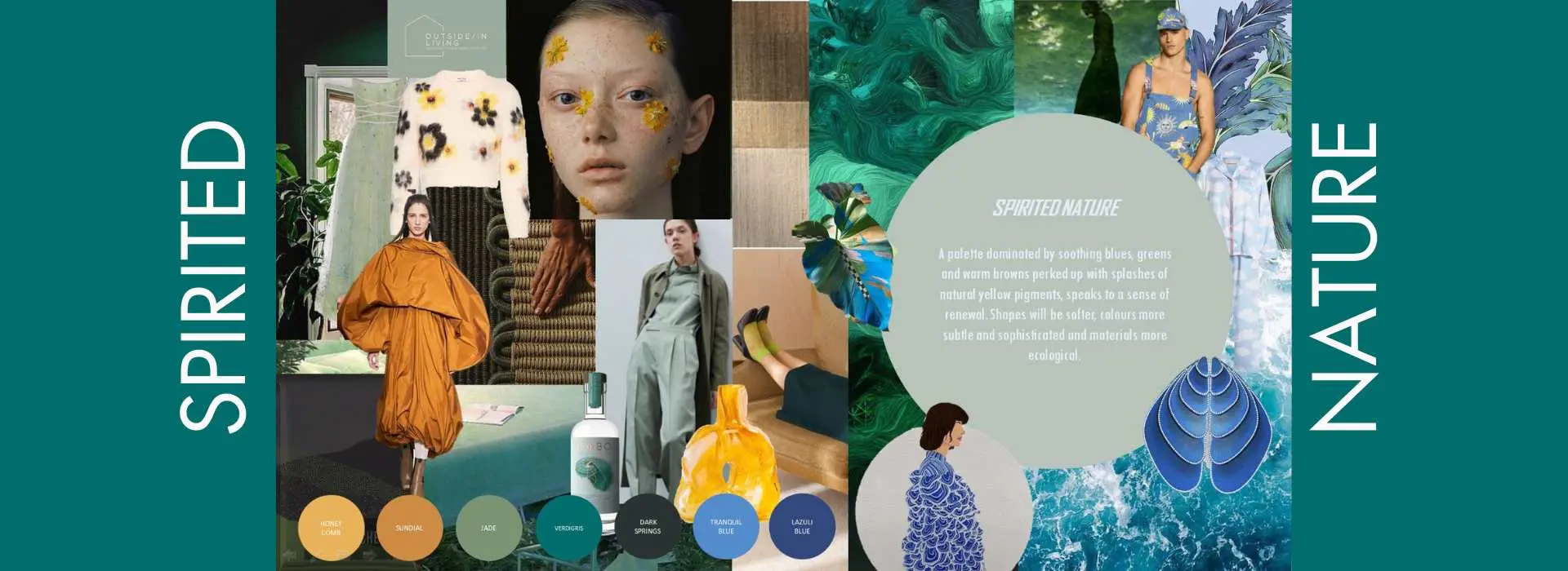
Nourishing natural greens will remain relevant as consumers focus onbalancing their mental and physical health. Jade is a timeless mid-tone with a transseasonal appeal, and its blue undertone gives it a calming and grounding quality.
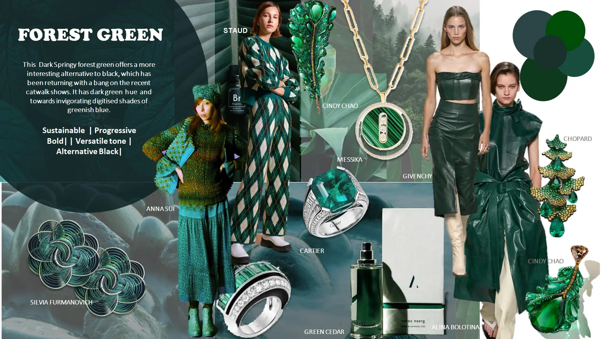
This Dark Springy forest green offers a more interesting alternative to black, which has been returning with a bang on the recent catwalk shows. It has dark green hue and towards invigorating digitised shades of greenish blue.
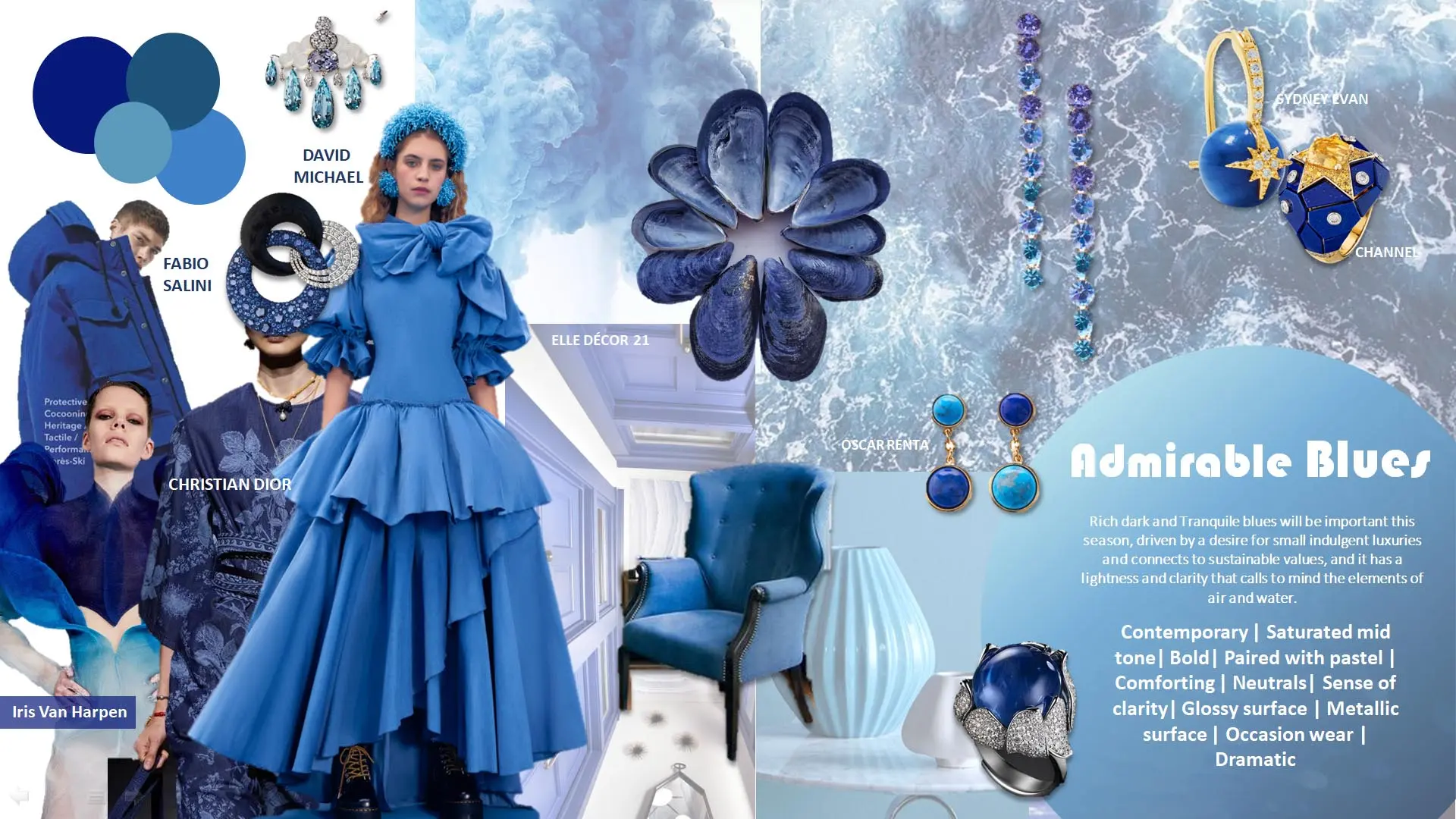
Rich dark and Tranquile blues will be important this season, driven by a desire for small indulgent luxuries and connects to sustainable values, and it has a lightness and clarity that calls to mind the elements of air and water.
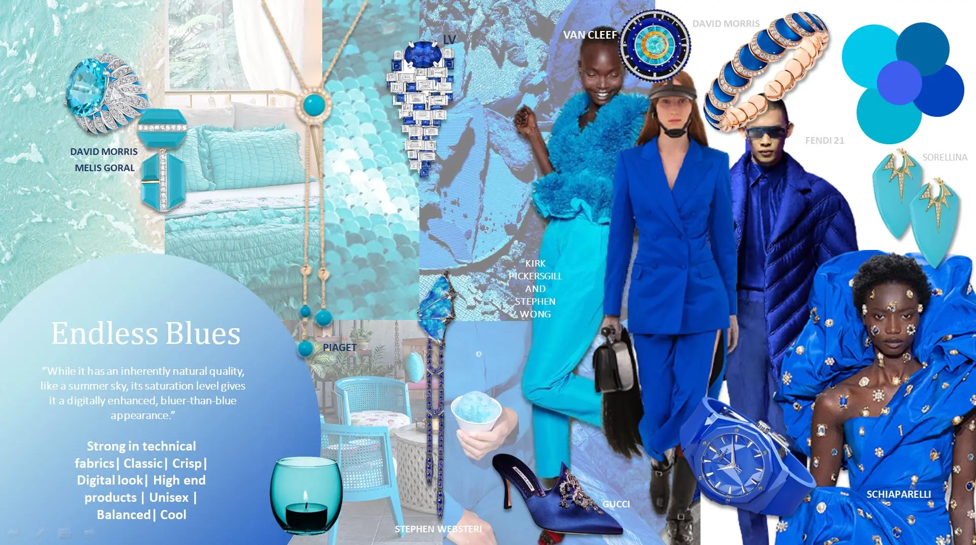
“While it has an inherently natural quality, like a summer sky, its saturation level gives it a digitally enhanced, bluer-than-blue appearance."
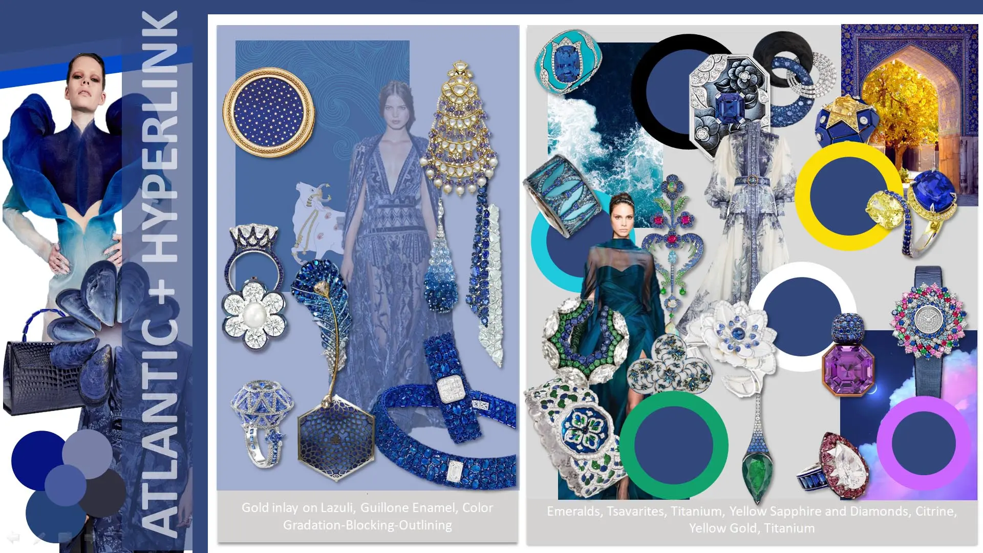
"Dive into the depths of jewelry trends with our Atlantic and Hyperlink Blue directional board, revealing the latest in-demand combinations and materials that are making waves in the market."
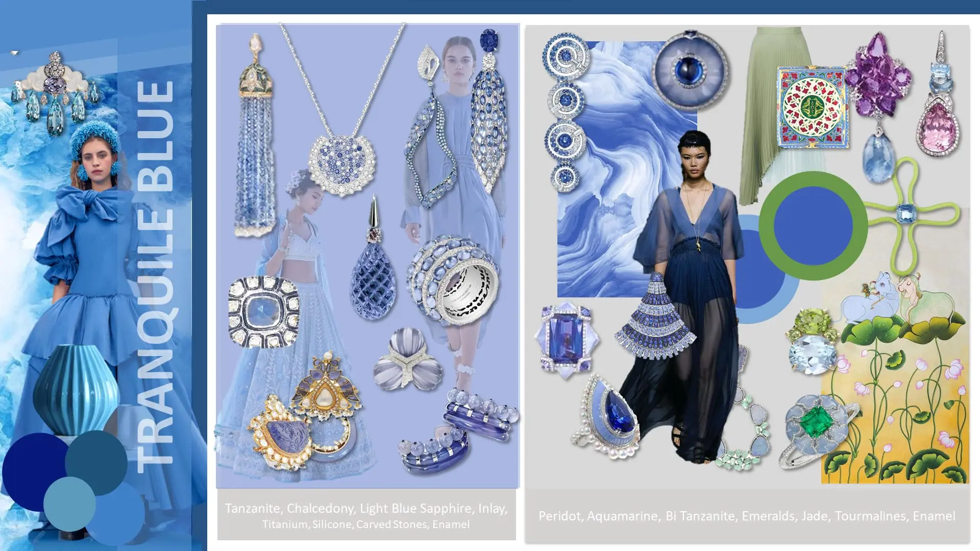
"Experience the serenity of jewelry fashion with our Tranquile directional board, where trending combinations and materials come together to define the latest in chic and calming accessories."
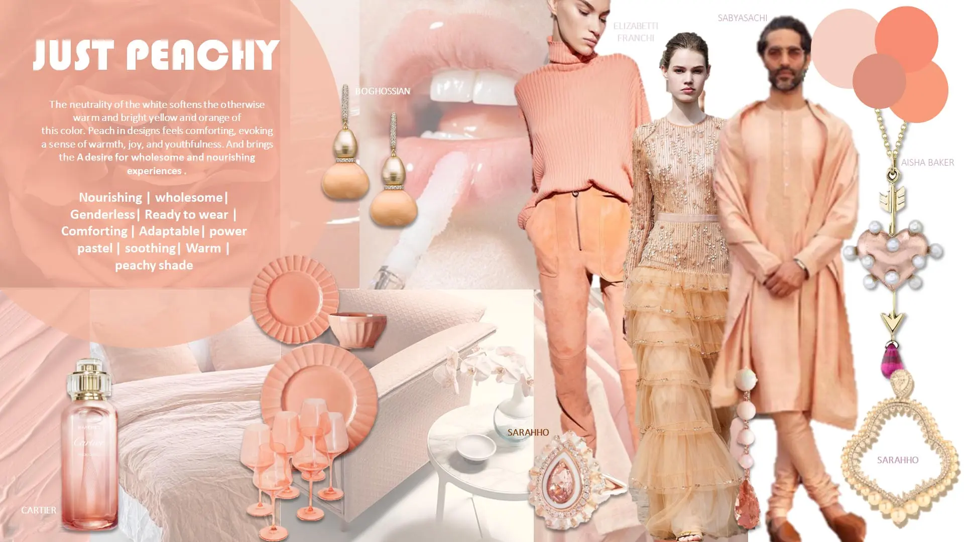
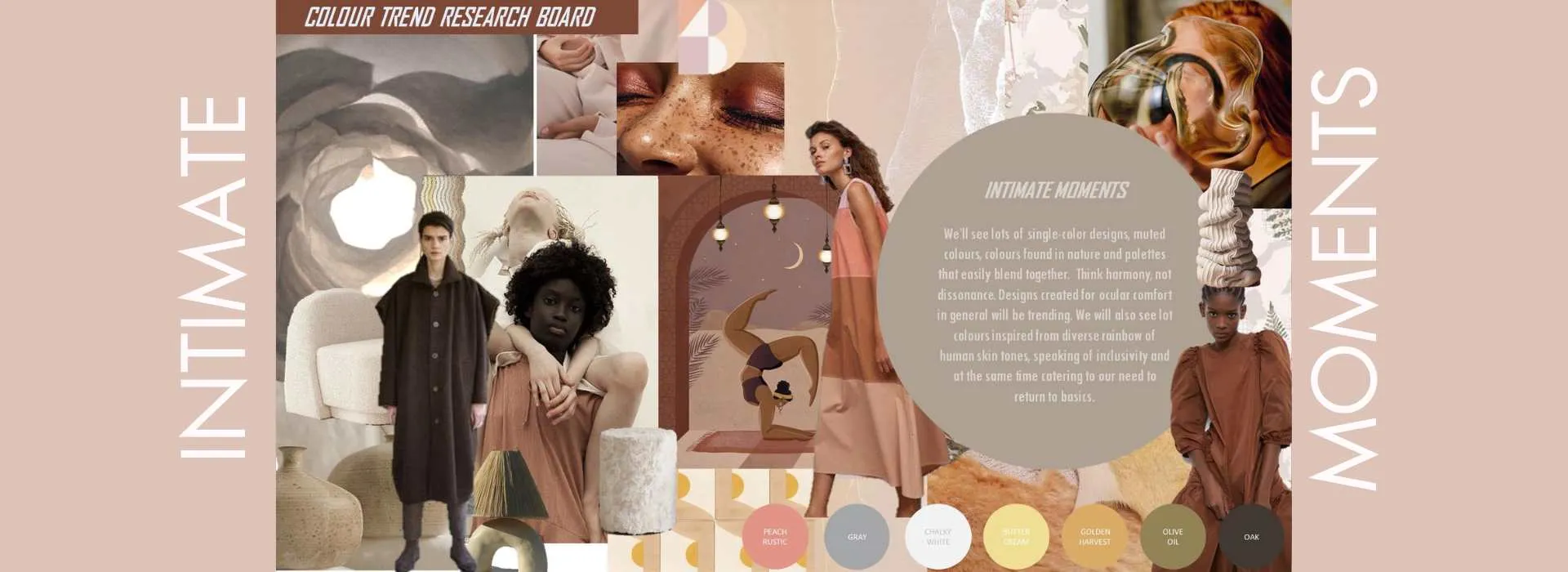
The neutrality of the white softens the otherwise warm and bright yellow and orange of this color. Peach in designs feels comforting, evoking a sense of warmth, joy, and youthfulness. And brings the A desire for wholesome and nourishing experiences .
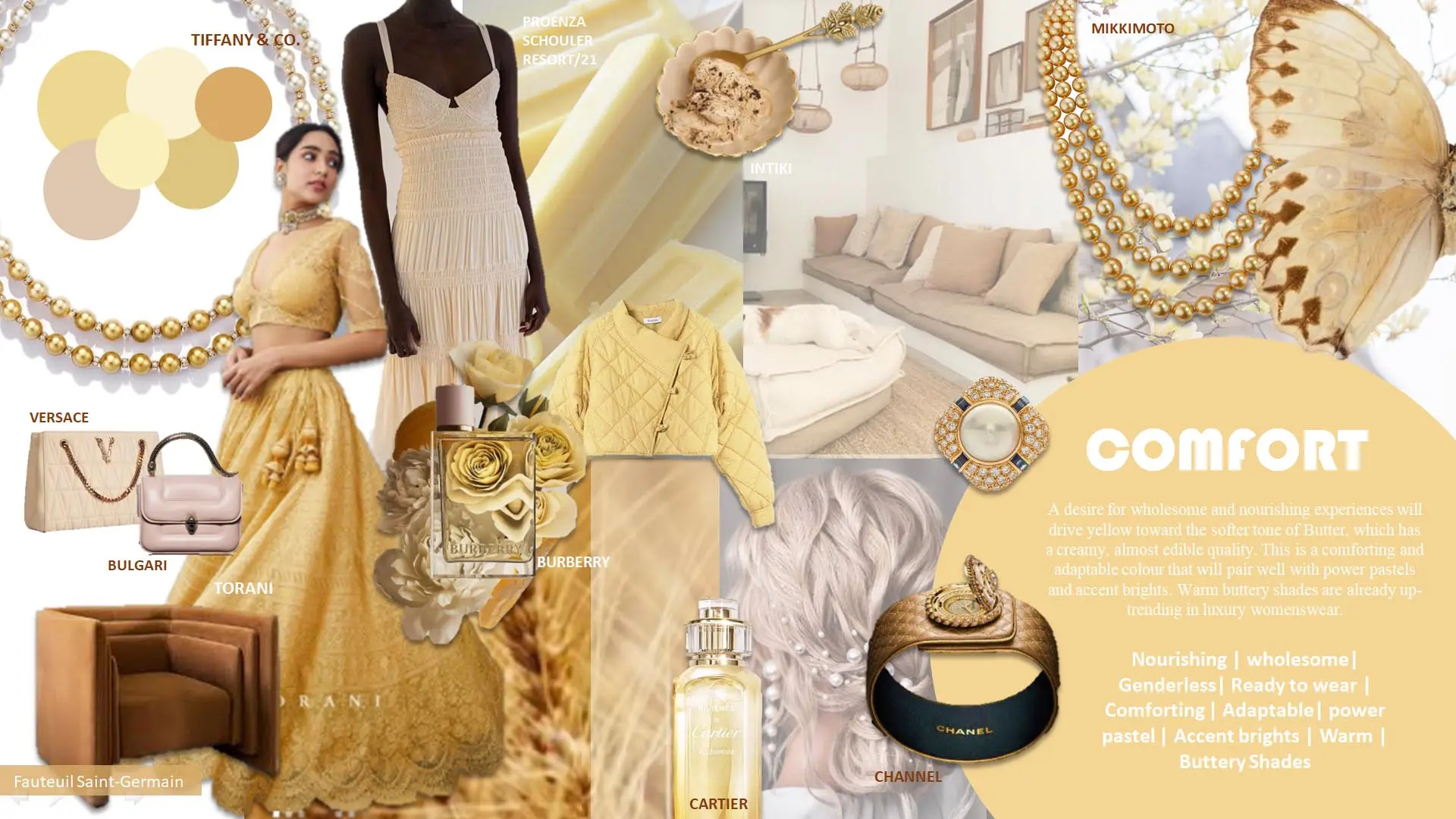
A desire for wholesome and nourishing experiences will drive yellow toward the softer tone of Butter, which has a creamy, almost edible quality. This is a comforting and adaptable colour that will pair well with power pastels and accent brights. Warm buttery shades are already up-trending in luxury womenswear.
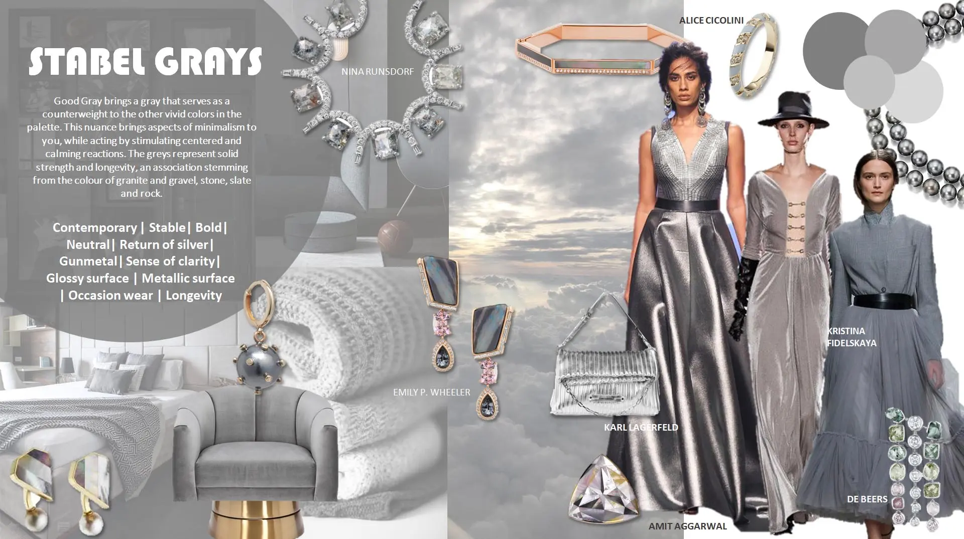
Good Gray brings a gray that serves as a counterweight to the other vivid colors in the palette. This nuance brings aspects of minimalism to you, while acting by stimulating centered and calming reactions. The greys represent solid strength and longevity, an association stemming from the colour of granite and gravel, stone, slate and rock.
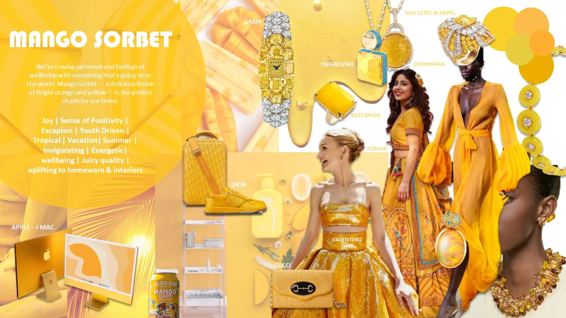
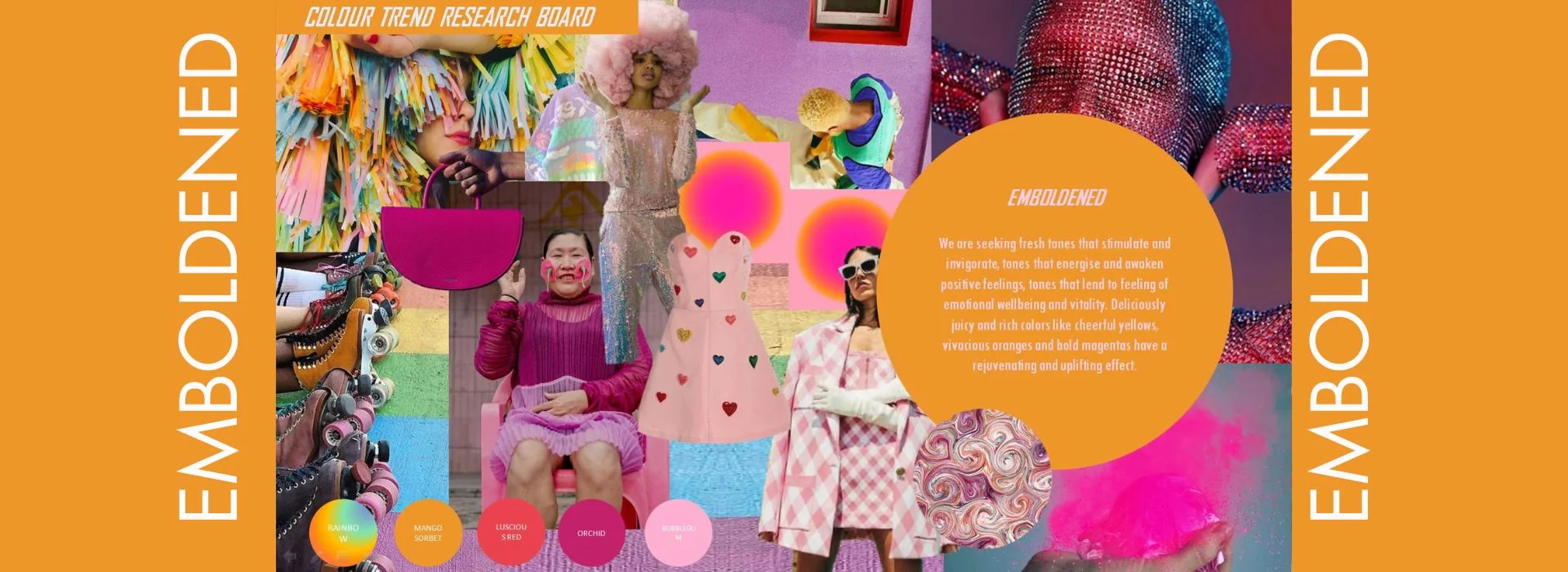
We're craving optimism and feelings of wellbeing with everything that's going on in the world. Mango sorbet — a delicious fusion of bright orange and yellow — is the perfect shade for our times.
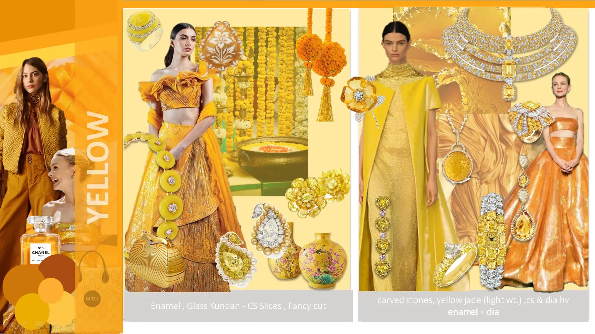
"Discover the sun-kissed allure of jewelry fashion on our Shades of Yellow directional board, unveiling the latest trends in materials and style that are bringing the warmth of yellow to the forefront."
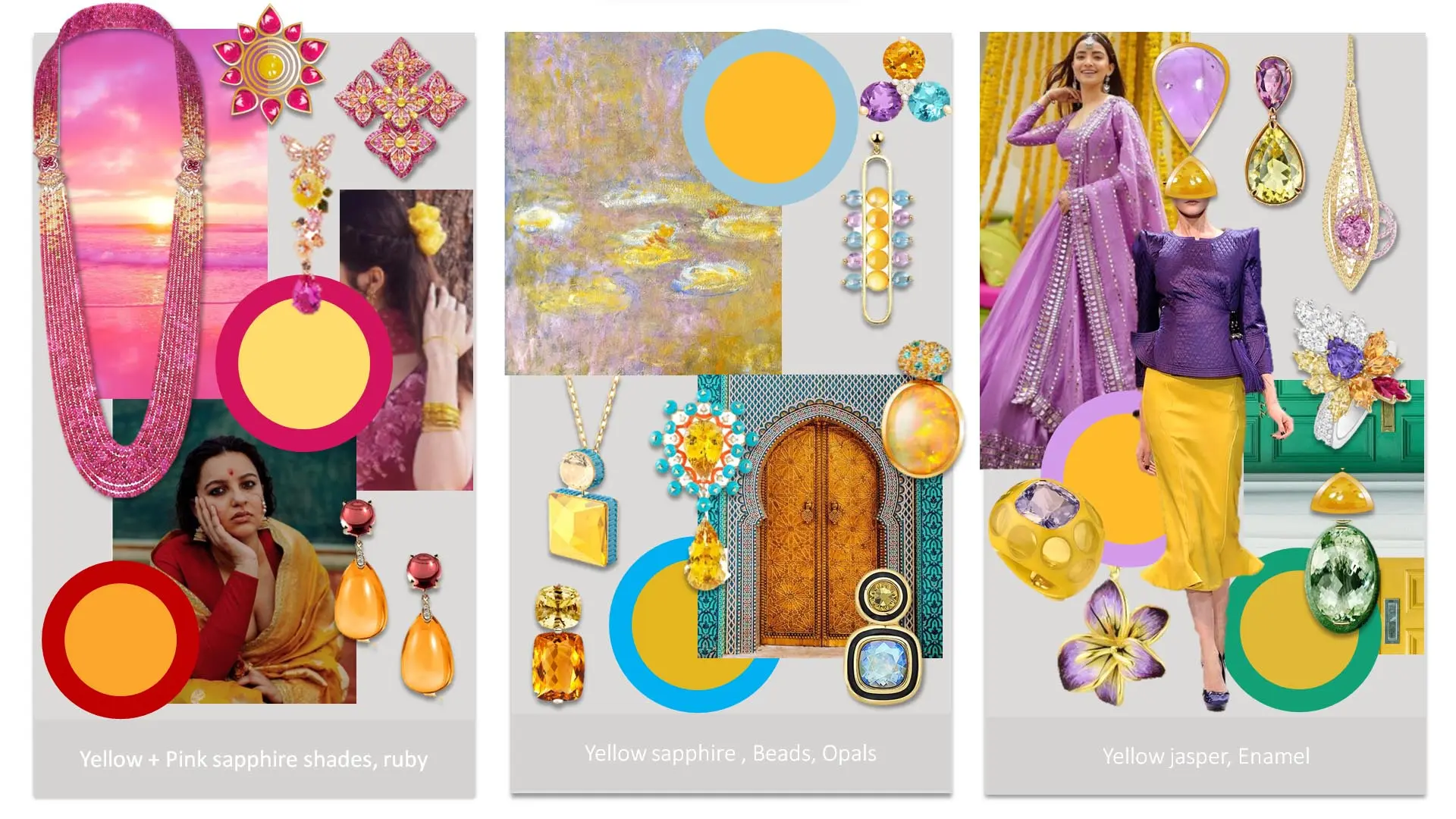
"Explore the radiant world of jewelry fashion with our Shades of Yellow directional board, where captivating combinations make your products stand out and shine amidst the crowd."
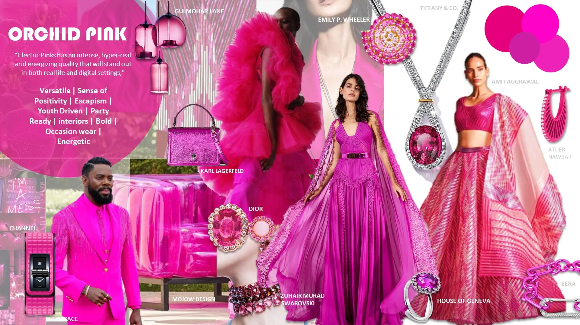
“Electric Pinks has an intense, hyper-real and energizing quality that will stand out in both real life and digital settings.
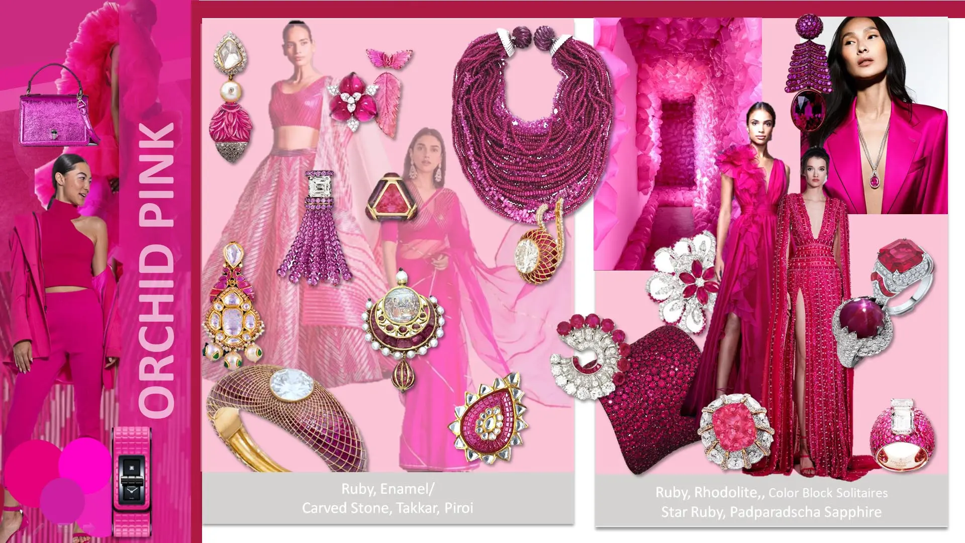
"Step into the world of jewelry trends with our Vibrant Orchid Pink directional board, highlighting the latest in-demand materials and fashion to keep you in vogue."
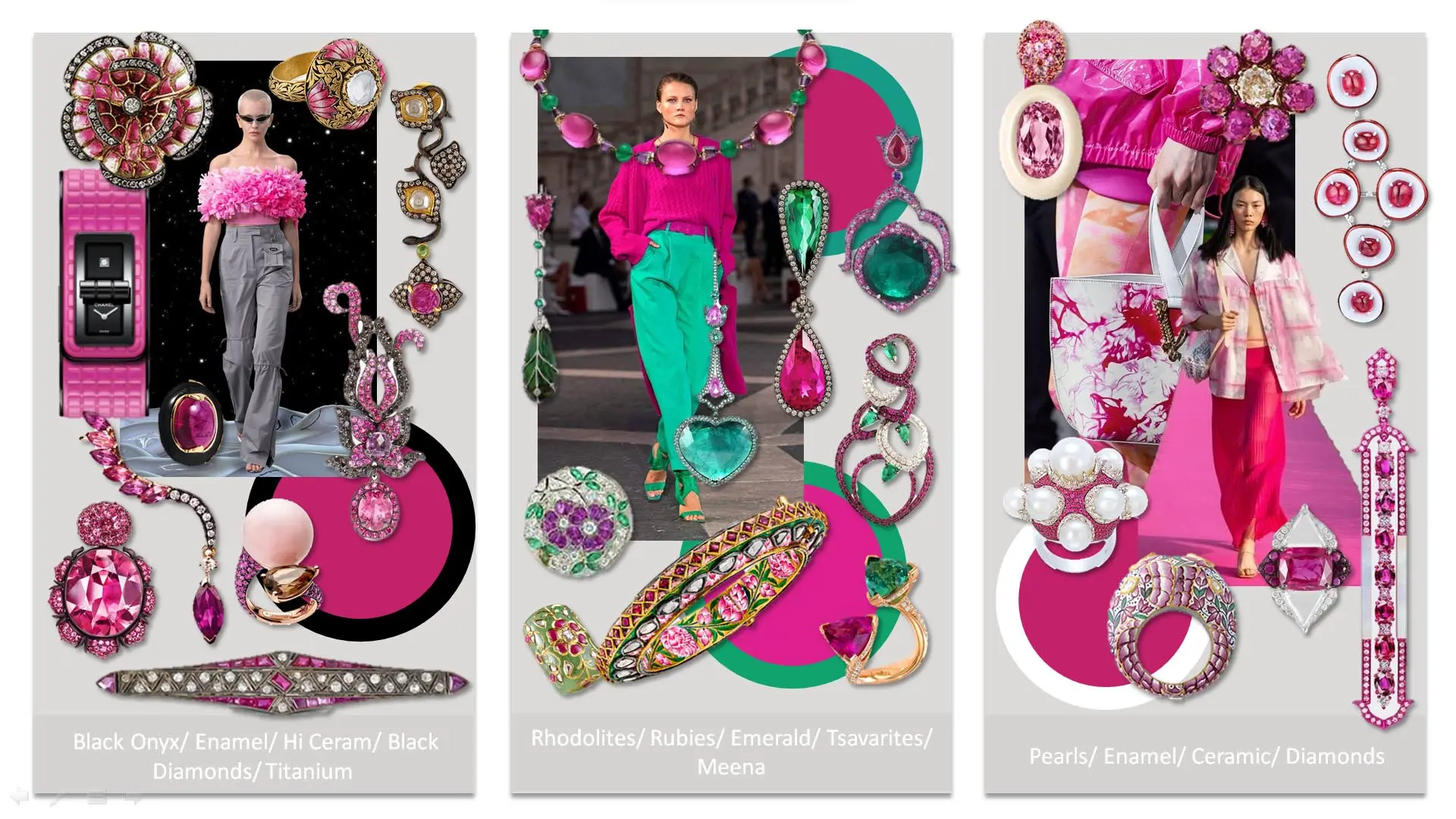
"Dive into the realm of jewelry fashion with our Vibrant Orchid Pink directional board, where intriguing combinations take your products to the next level, making them stand out in style."
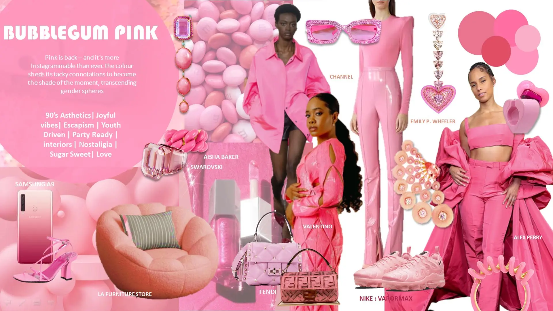
Pink is back – and it's more Instagrammable than ever. the colour sheds its tacky connotations to become the shade of the moment, transcending gender spheres
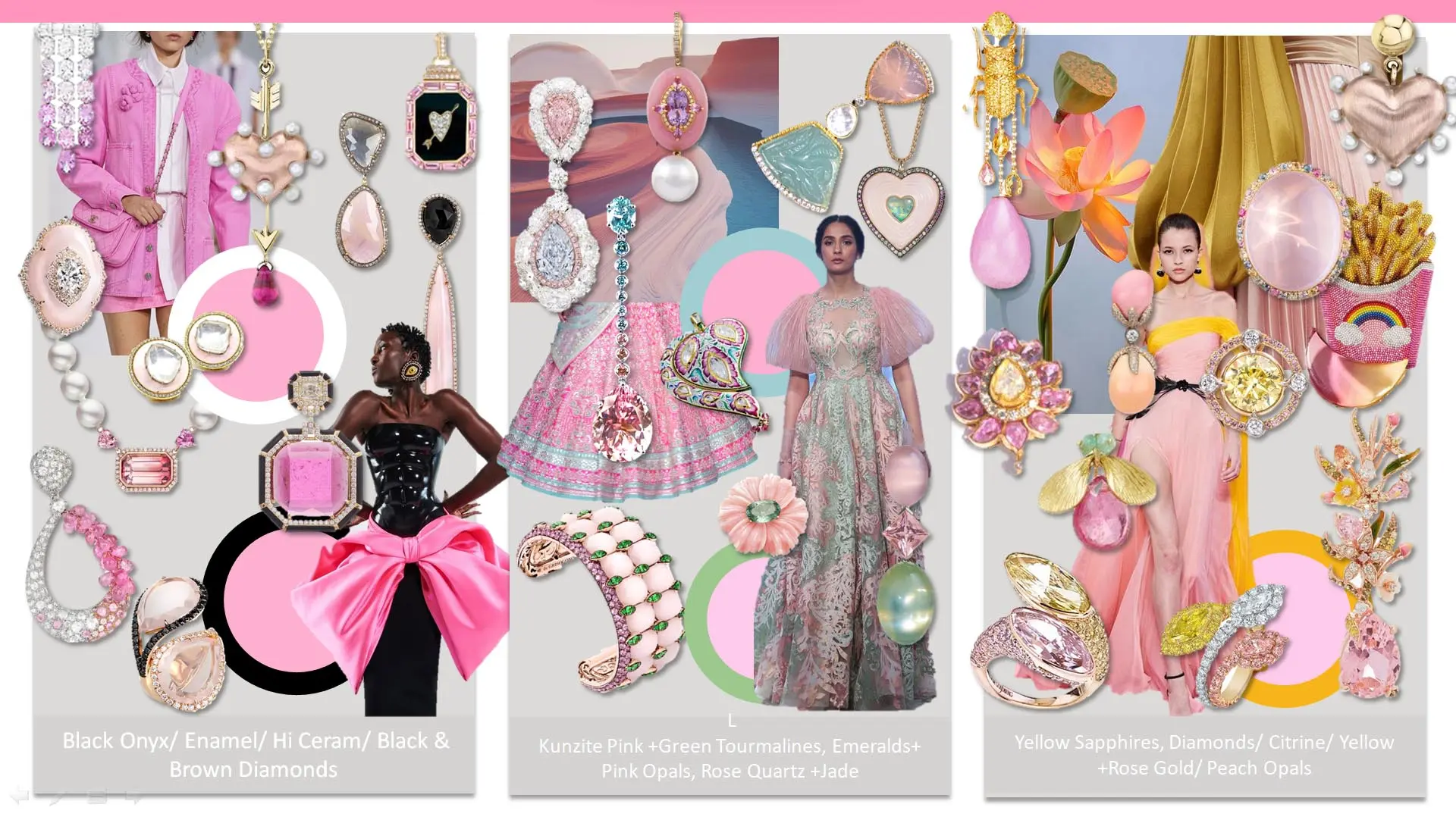
"Explore the world of jewelry fashion with our Soft Bubblegum Pink directional board, where creative combinations turn your products into standout pieces, leaving a lasting impression."
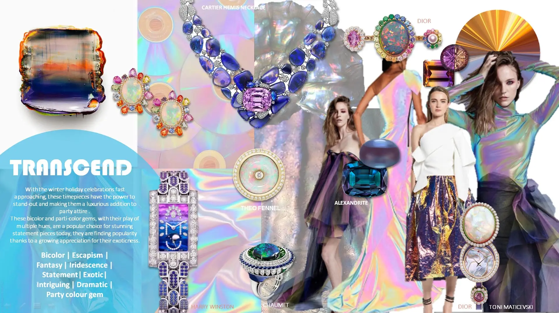
With the winter holiday celebrations fast approaching, these timepieces have the power to stand-out and making them a luxurious addition to party attire . These bicolor and parti-color gems, with their play of multiple hues, are a popular choice for stunning statement pieces today, they are finding popularity thanks to a growing appreciation for their exoticness.
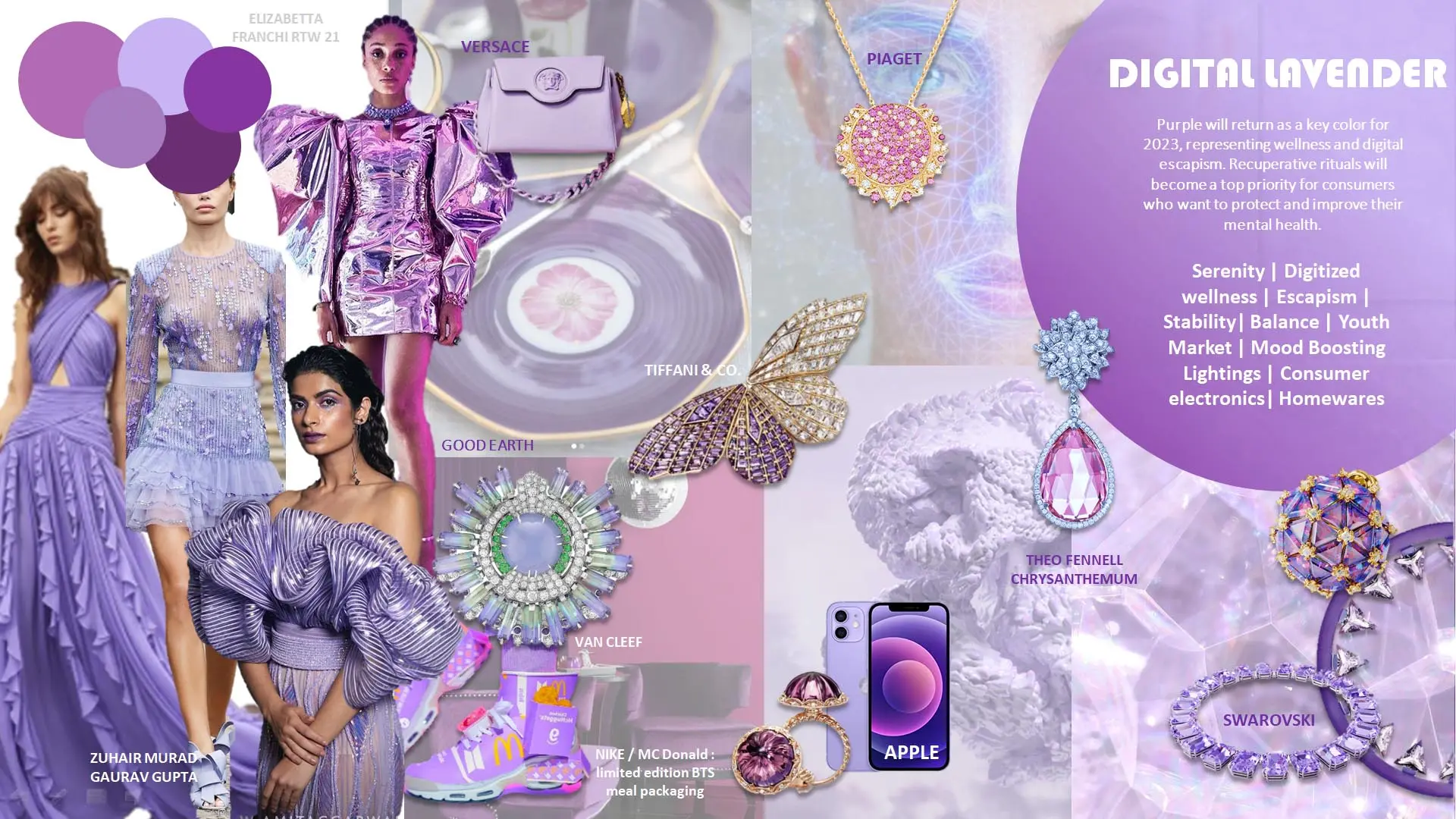
Purple will return as a key color for 2023, representing wellness and digital escapism. Recuperative rituals will become a top priority for consumers who want to protect and improve their mental health.
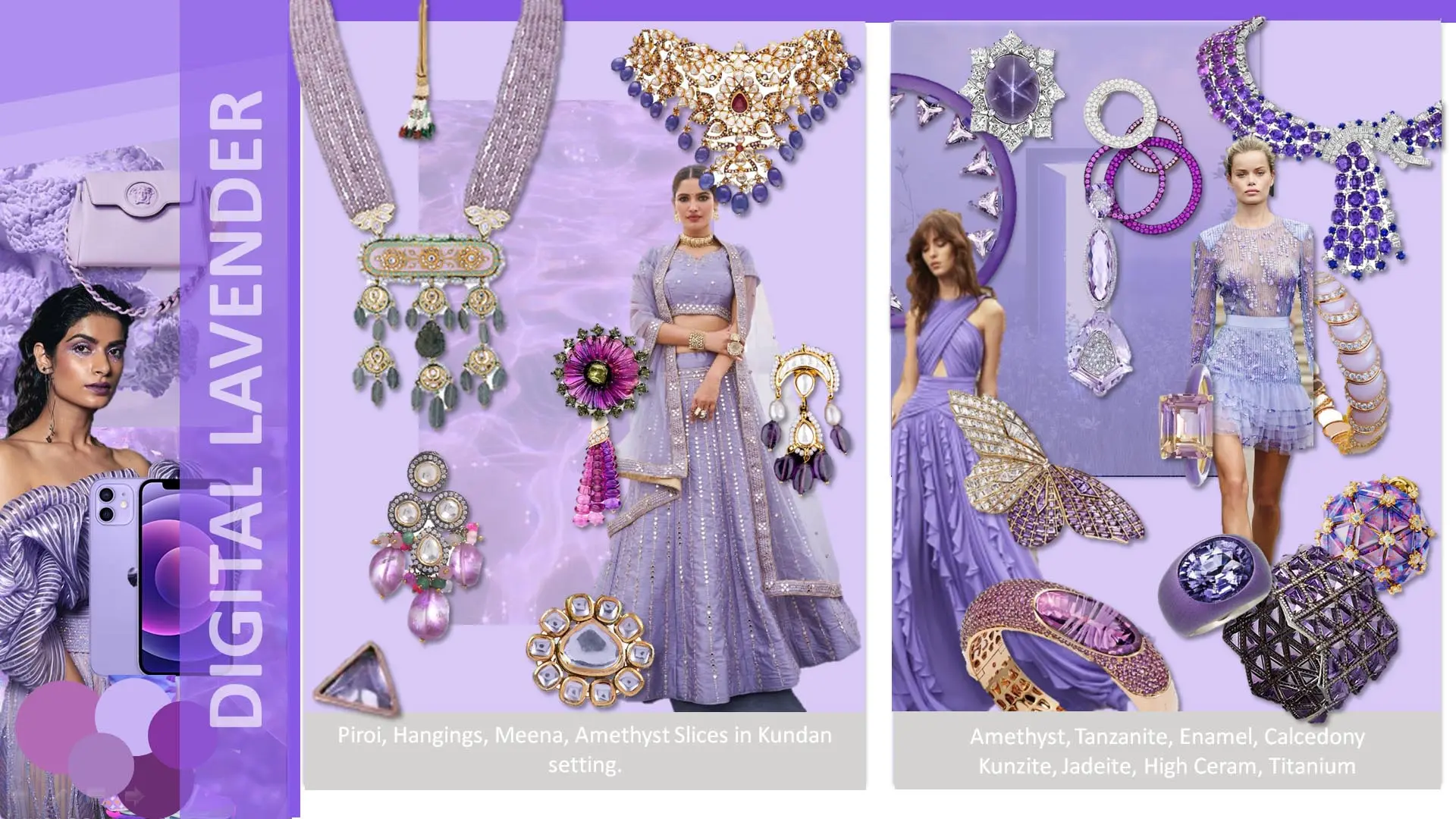
"Discover the future of jewelry fashion with our Digital Lavender directional board, showcasing the latest trends in materials and style that embody the digital age's elegance."


