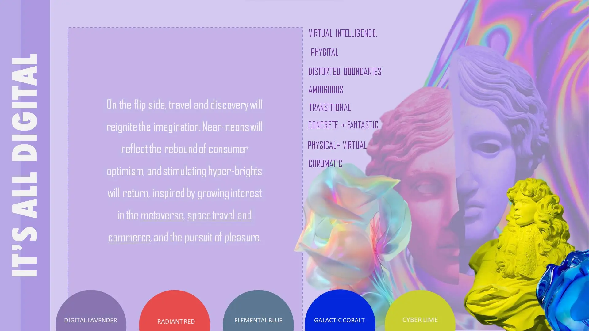
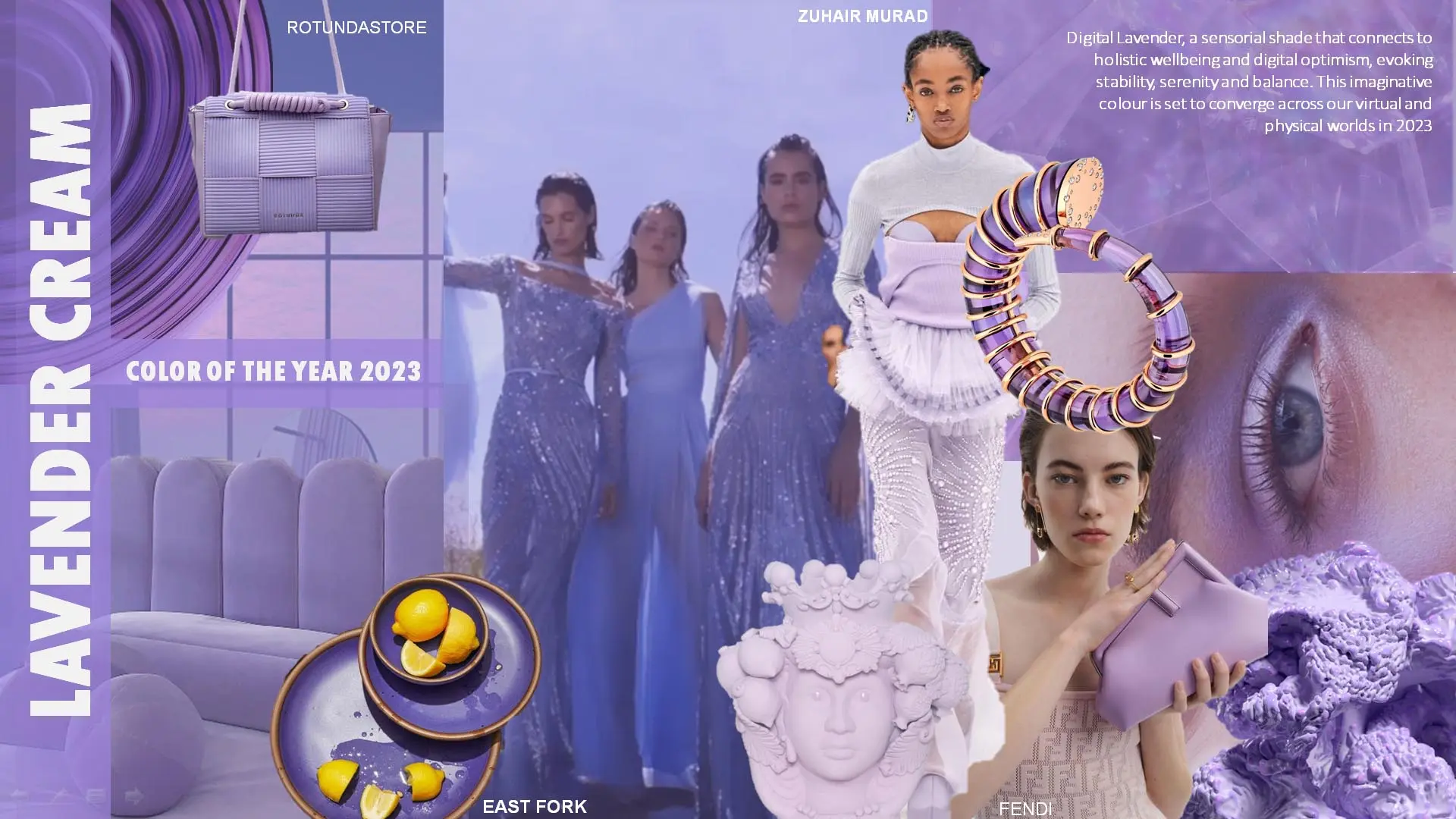
LAVENDER CREAM , a sensorial shade that connects to holistic wellbeing and digital optimism. This imaginative colour is set to converge across our virtual and physical worlds in 2023.
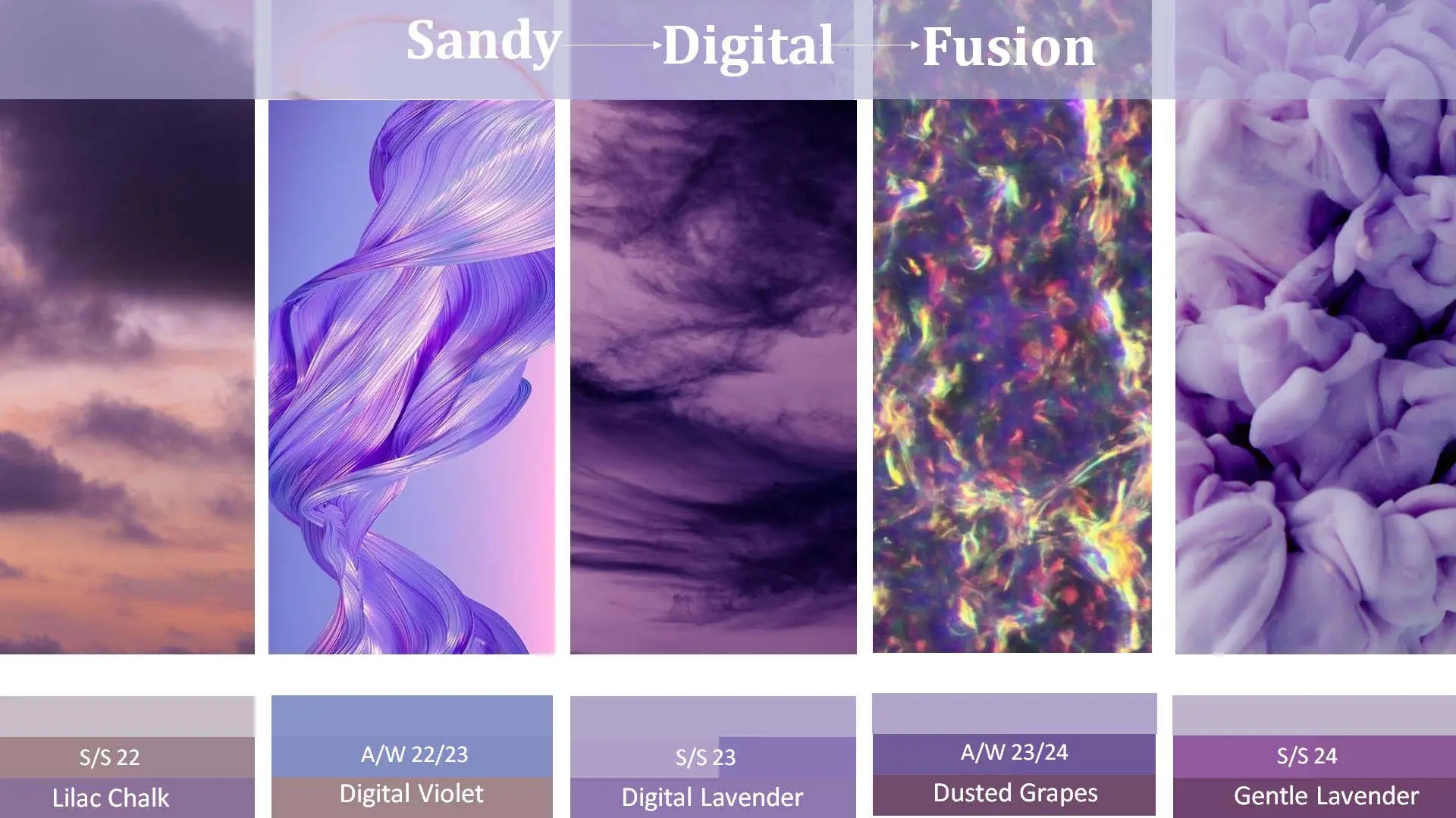
Lavender cream evolution from SS 22 TO SS 24 . Observed that Purple will rise in importance AND plays a supportive role and return to greyer, warmer shades.
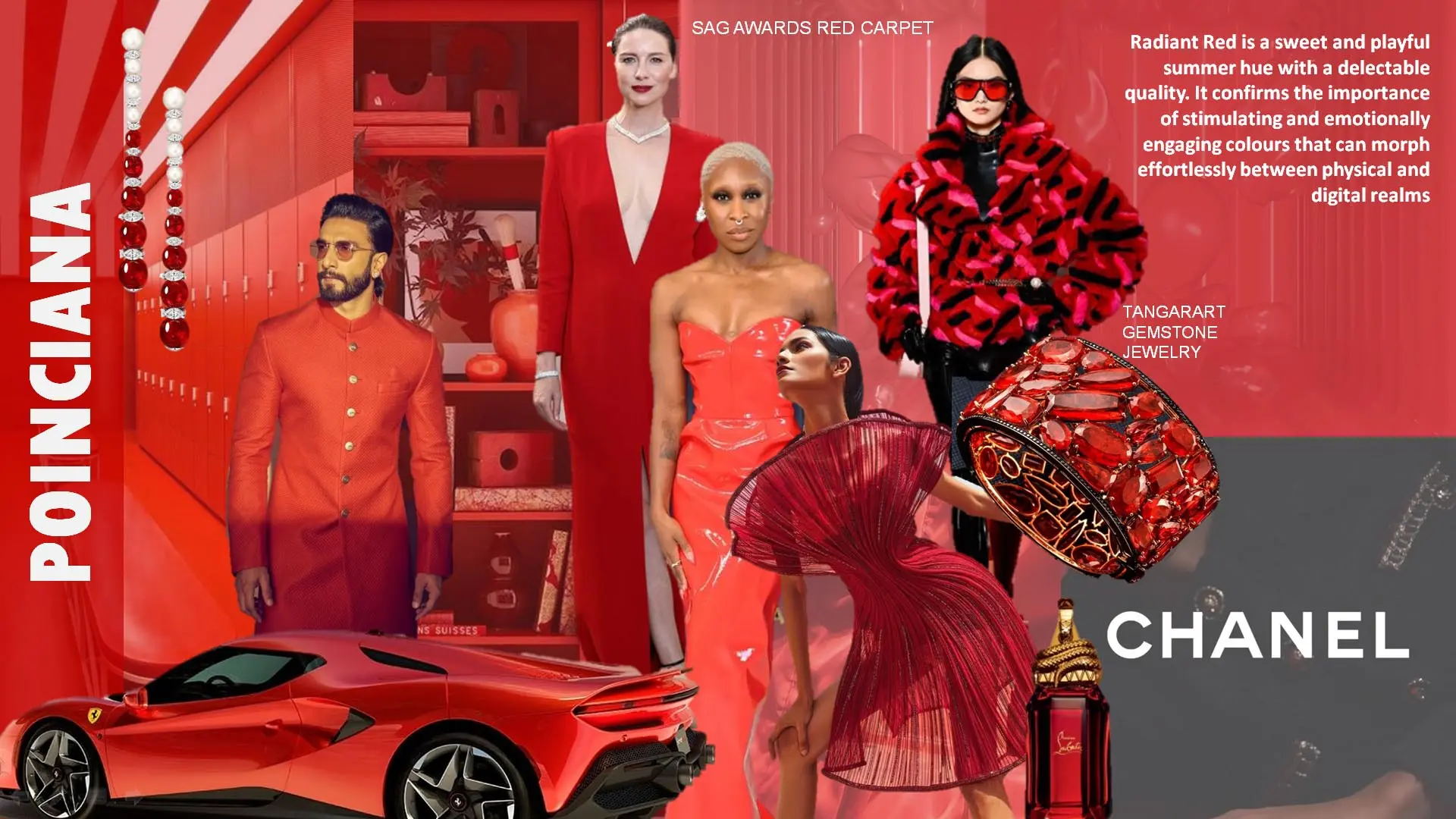
POINCIANA IS a Radiant Red is a sweet and playful summer hue with a delectable quality. It confirms the importance of stimulating and emotionally engaging colours that can morph effortlessly between physical and digital realms. This red feels light and youthful, and yet its optimistic nature relates to all age demographics and genders. While its exuberance shouts high summer.
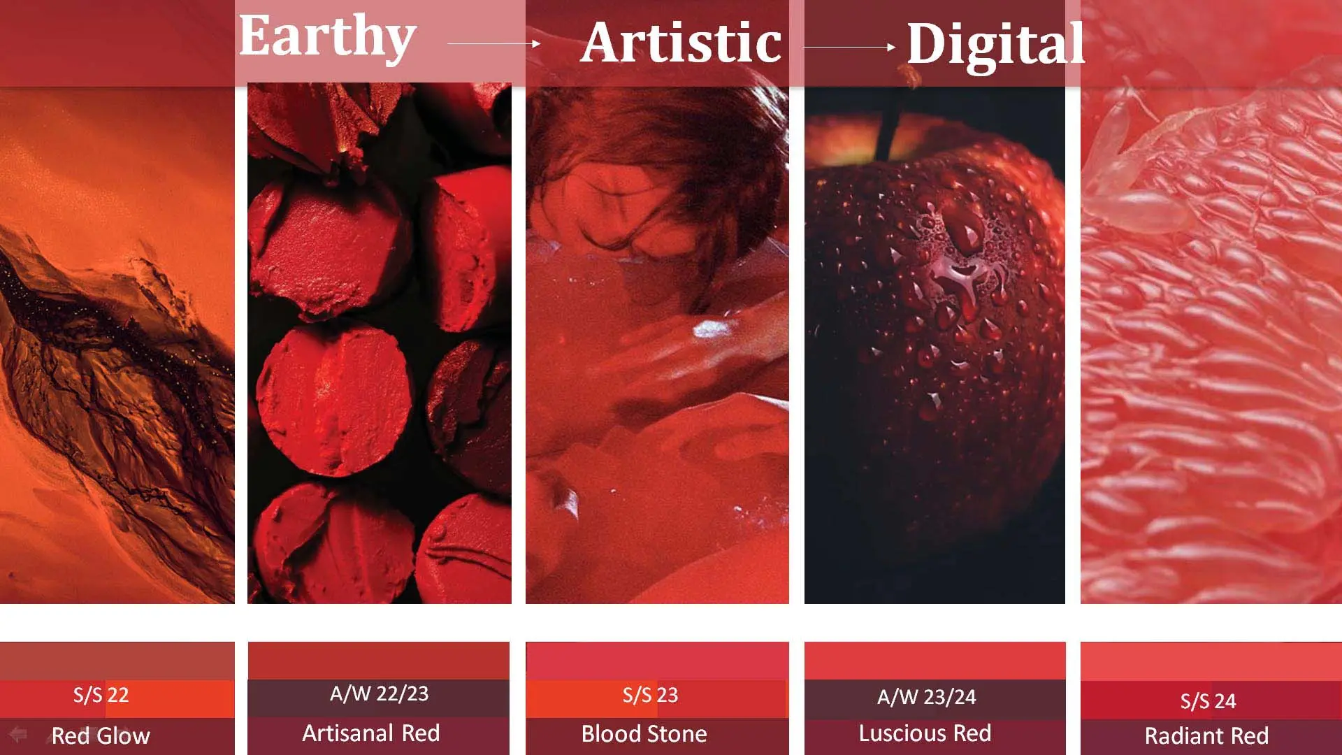
Red will step back this season as other colours take precedence. It will evolve from earthy shades of red glow to artistic shades of red to blood stones continue evolving as digital shade of red.
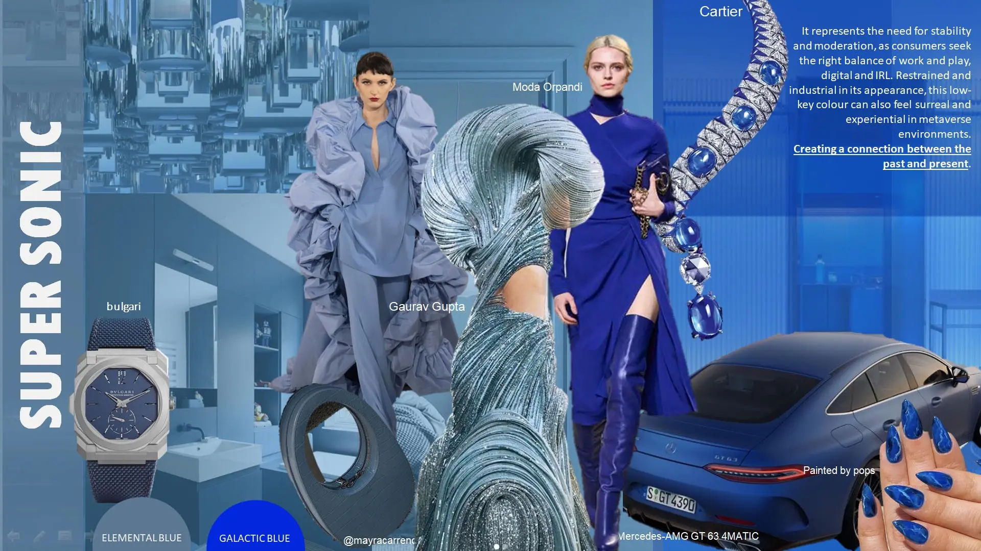
super sonic It represents the need for stability and moderation, as consumers seek the right balance of work and play, digital and IRL. Creating a connection between the past and present.
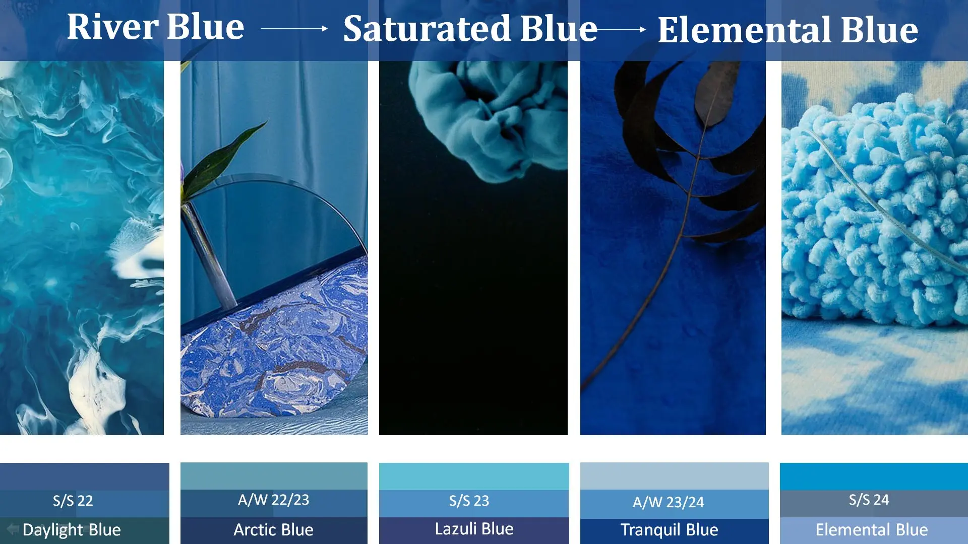
Daylight Blue marks a shift back to saturated, red-infused shades moving towards saturated tone to desaturated tone and returning back to red infused light elemental blue.
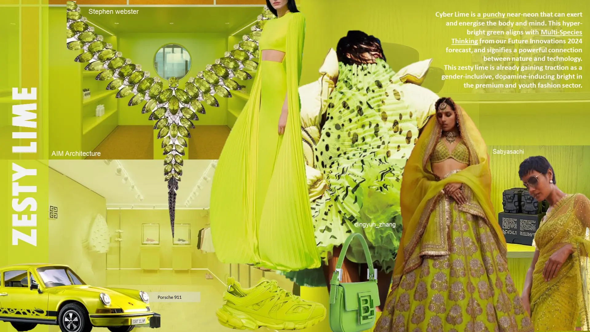
zesty Lime is a punchy near-neon that can exert and energise the body and mind. This hyper-bright green signifies a powerful connection between nature and technology. This zesty lime is already gaining traction as a gender-inclusive, dopamine-inducing bright in the premium and youth fashion sector.
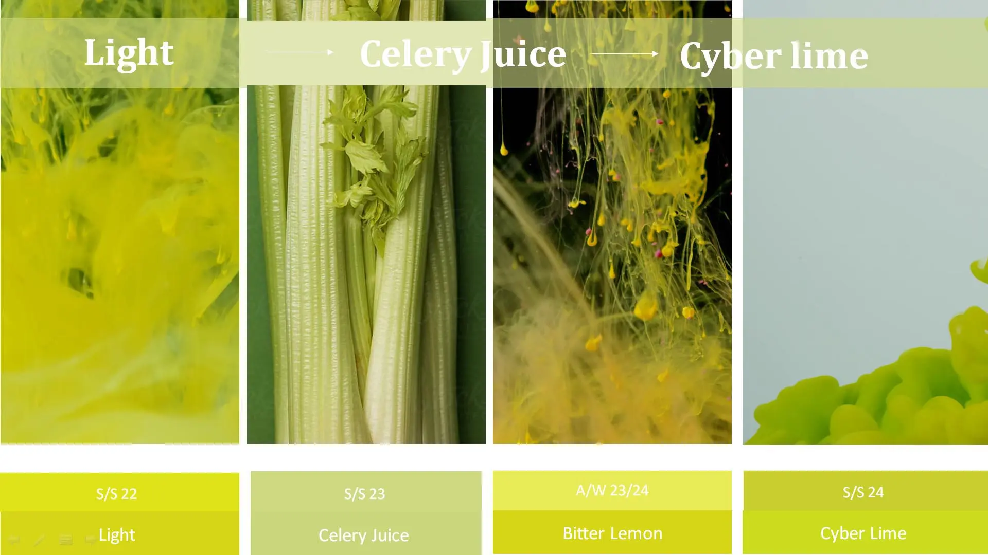
zesty Lime is a punchy near-neon that can exert and energise the body and mind. This hyper-bright green signifies a powerful connection between nature and technology. This zesty lime is already gaining traction as a gender-inclusive, dopamine-inducing bright in the premium and youth fashion sector.
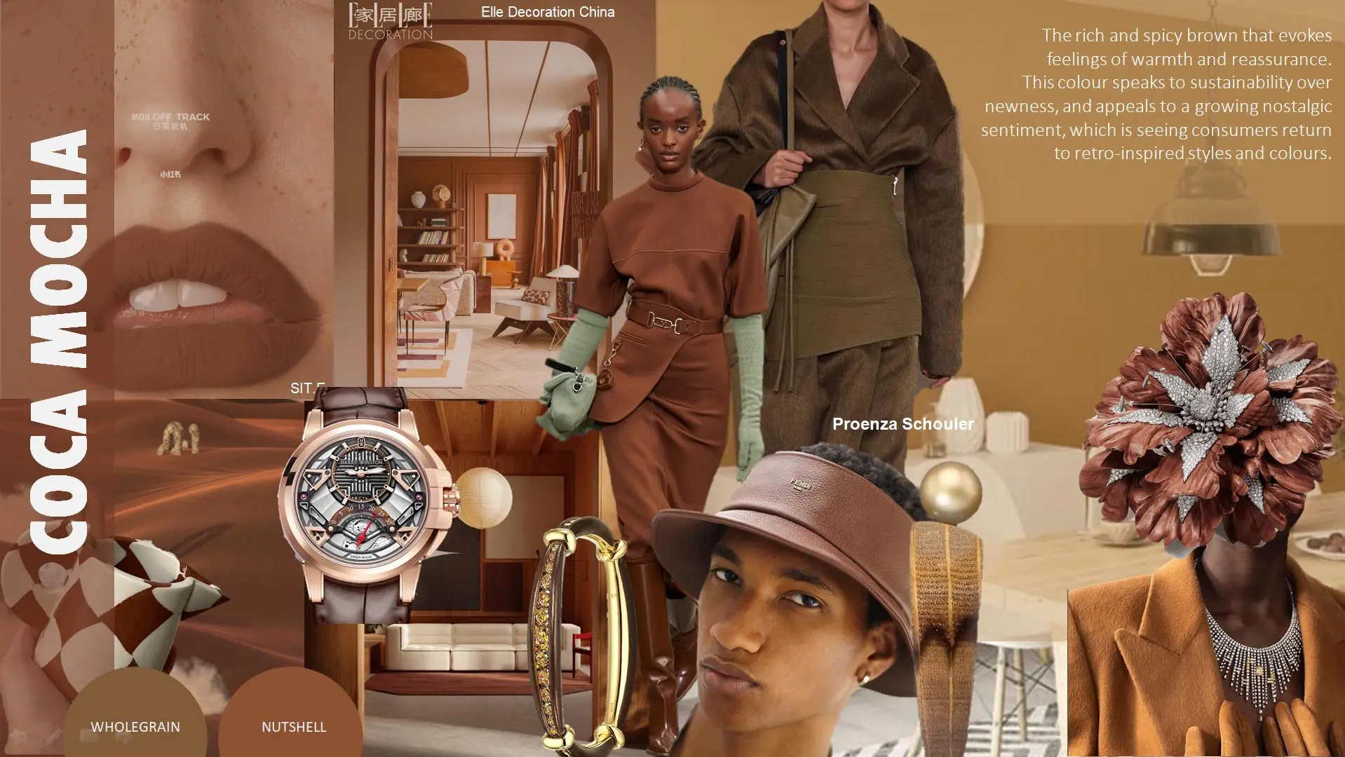
The rich and spicy brown that evokes feelings of warmth and reassurance. This colour speaks to sustainability over newness, and appeals to a growing nostalgic sentiment, which is seeing consumers return to retro-inspired styles and Connects to themes of authenticity and craftsmanship.
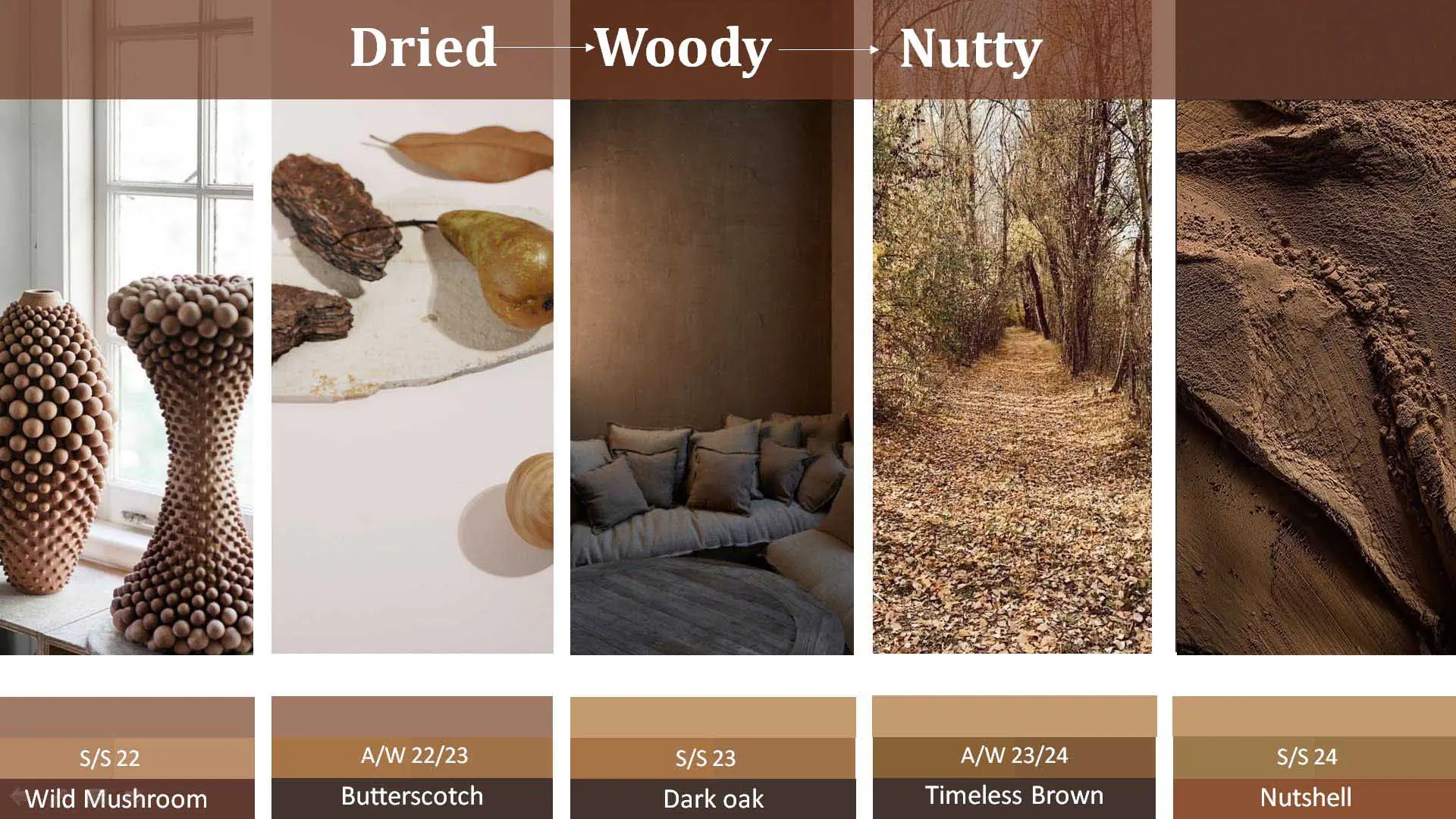
The need for commercial neutrals will drive a focus on classic browns to intense Dark Oak and remains the darkest brown in the palette and further infused it with yellow and turn into characterful Nutshell.
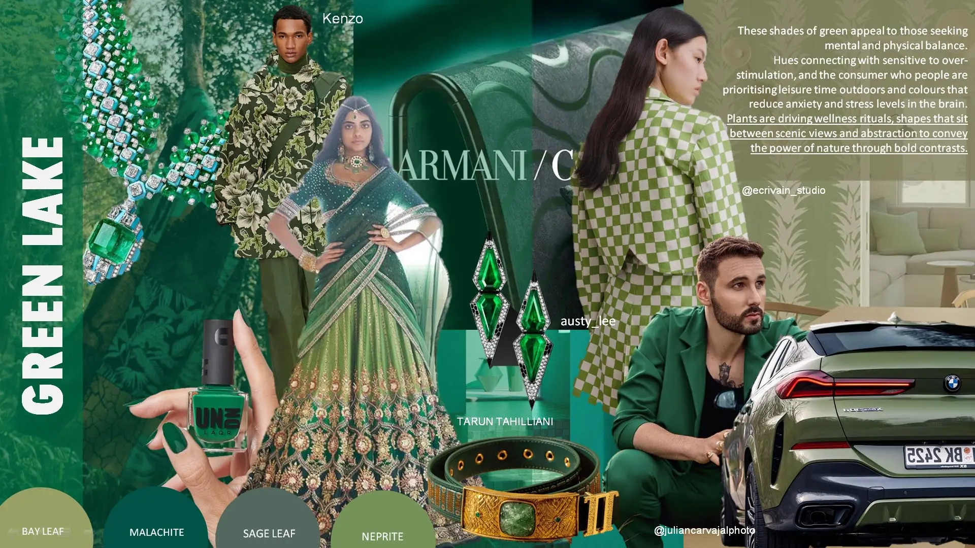
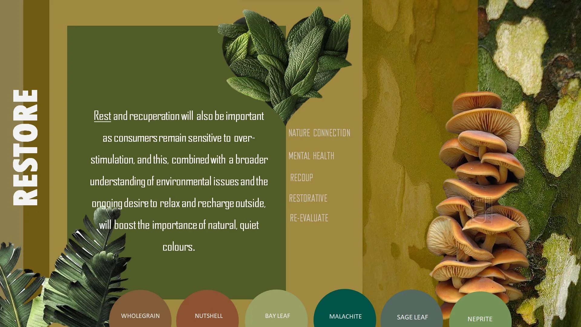
These shades of green appeal to those seeking mental and physical balance. Hues connecting with sensitive to over-stimulation, and the consumer who people are prioritising leisure time outdoors and colours that reduce anxiety and stress levels in the brain.
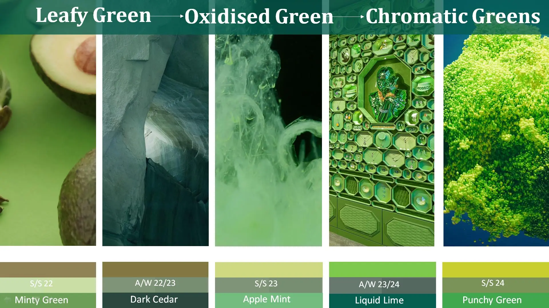
Green will move in two directions with yellow-tinted Olive Oil and blue-tinted hues such as Jade and Dark Cedar further accompanied by shades of apple mint liquid lime and punchy green .
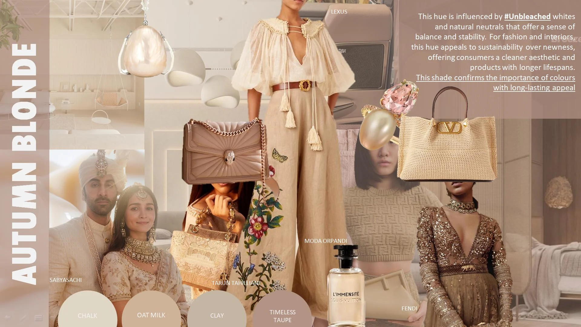
This hue is influenced by #Unbleached whites and natural neutrals that offer a sense of balance and stability. For fashion and interiors, this hue appeals to sustainability over newness, offering consumers a cleaner aesthetic and products with longer lifespans. This shade confirms the importance of colours with long-lasting appeal.
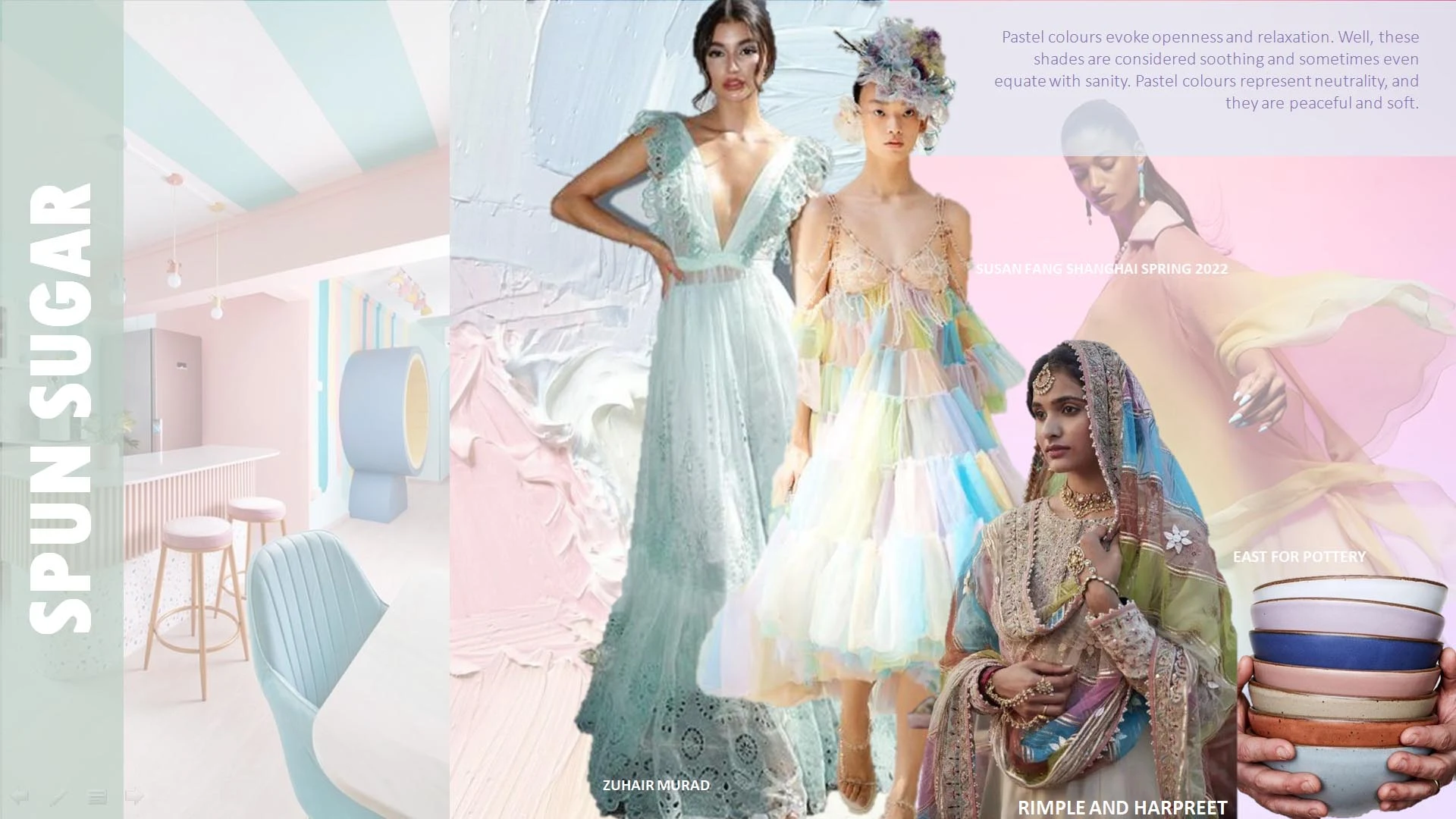
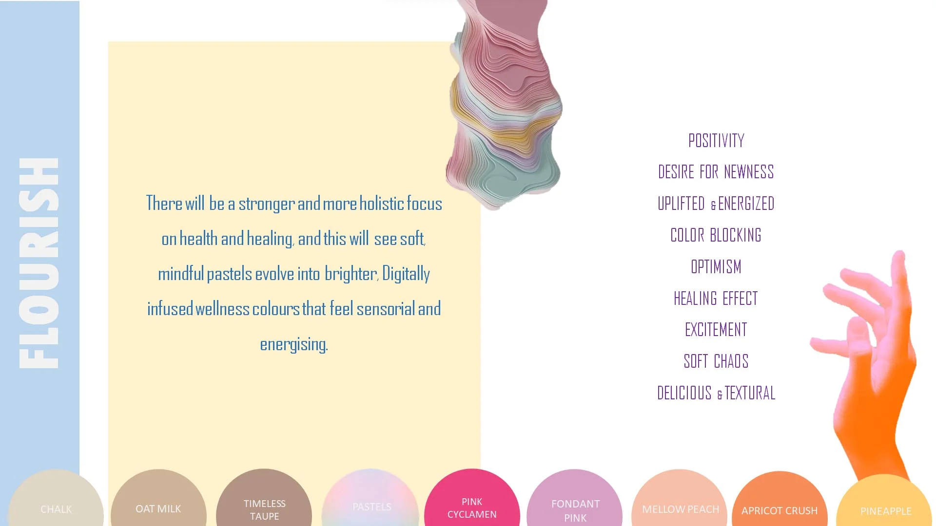
Pastel colours evoke openness and relaxation. Well, these shades are considered soothing and sometimes even equate with sanity. Pastel colours represent neutrality, and they are peaceful and soft.
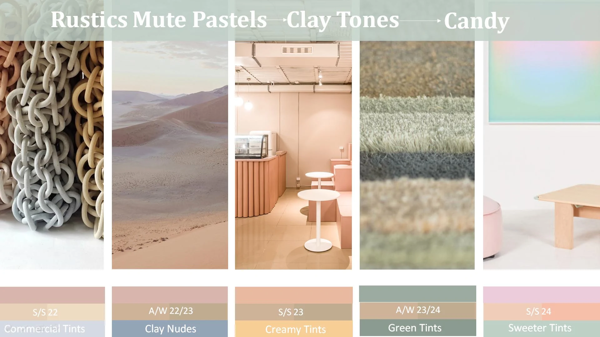
AUTUM BLONDE AND PASTELS ARE EVOLVED TOGETHER FOR THIS SEASON. It states that S/S 22 pastels will be mineral-based and saturated, but not sweet. Pastels will become darker and more pigmented for AW. LATER Pastels will lighten and brighten by S/S 24 returning to sweeter levels.
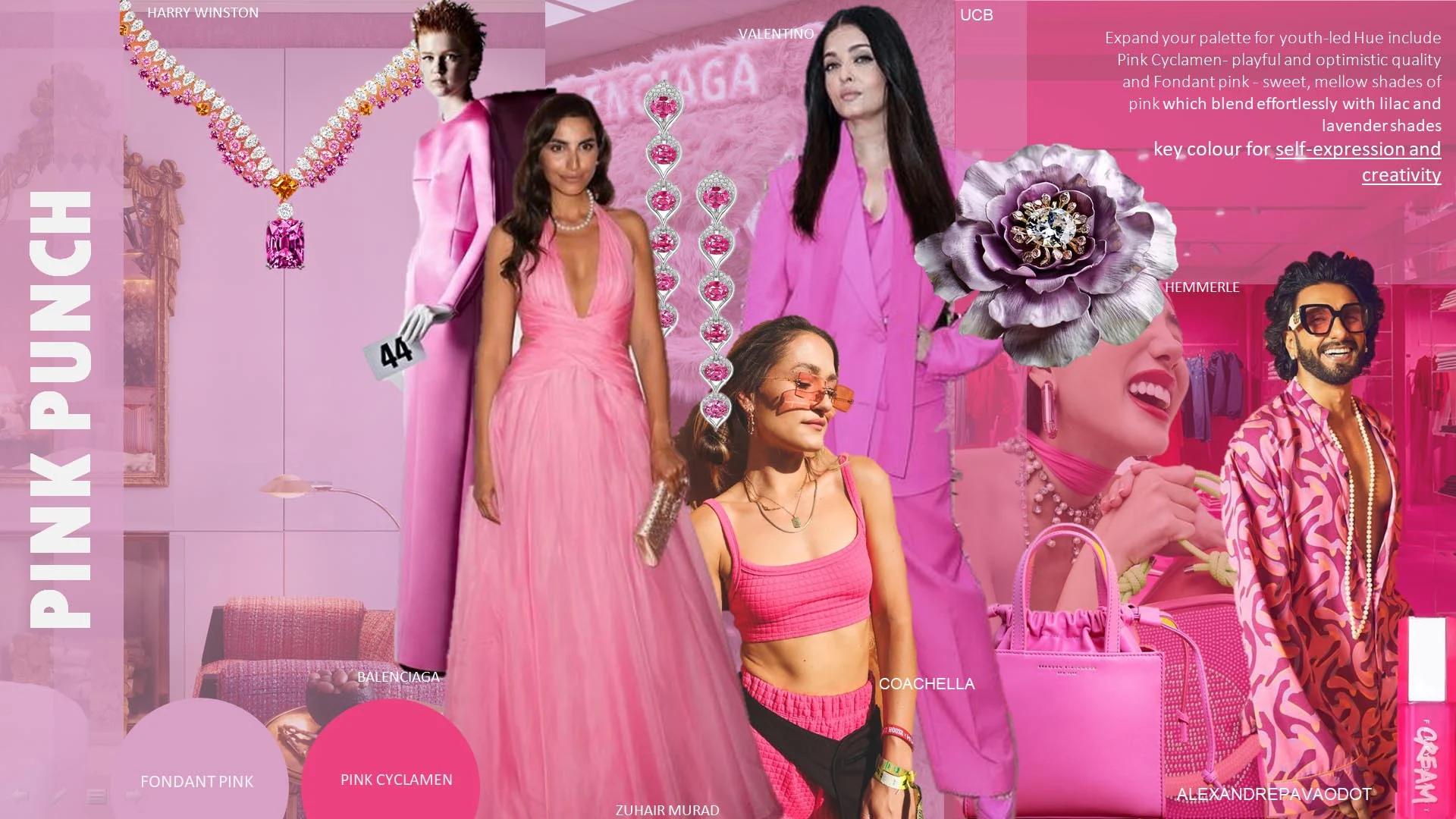
PINK PUNCH WILL Expand your palette for youth-led Hue include Pink Cyclamen HAS playful and optimistic quality and Fondant pink WILL BE sweet, mellow shades of pink which blend effortlessly with lilac and lavender shades THESE SHADES ARE THE key colour for self-expression and creativity.
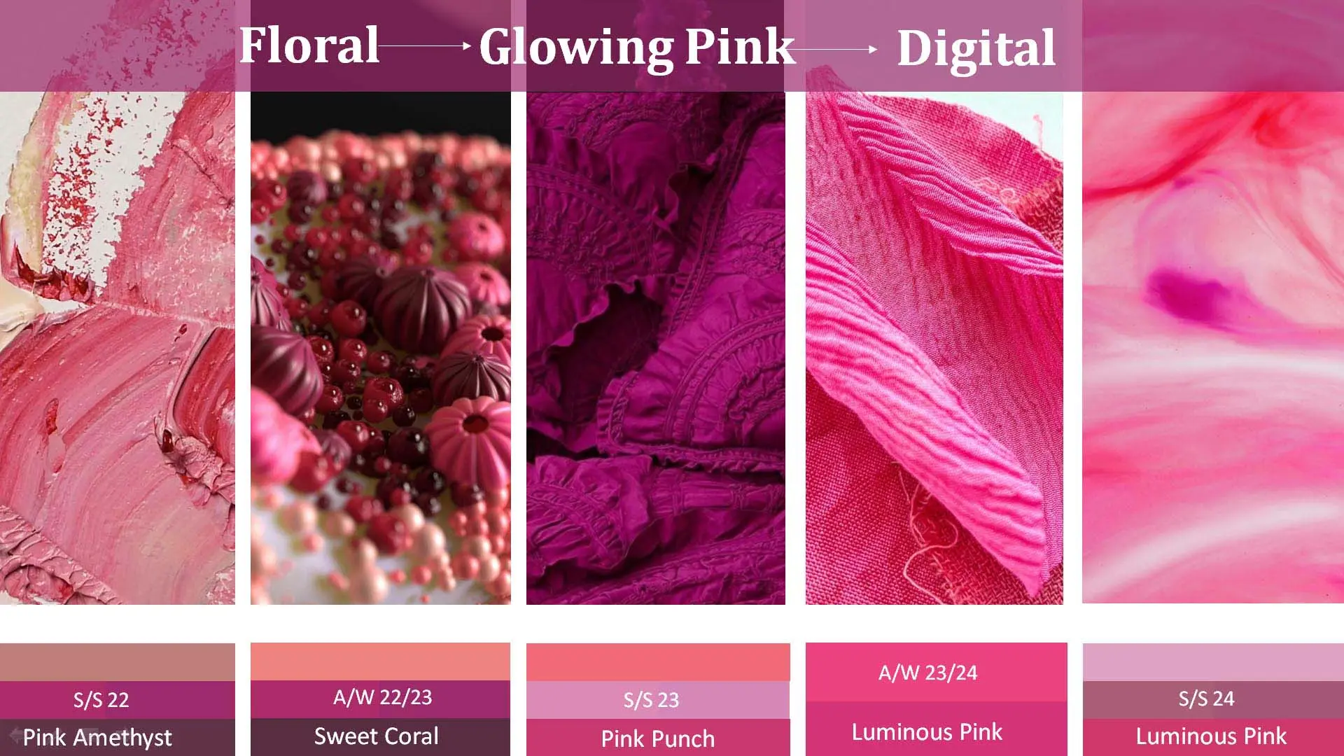
Pink steps up to become one of the most important colour groups. With the muted shade to seasonal dark and indicate the return of warm mid-tone pinks , evolves to Fuchsia later will be replaced by the brighter tone of Luminous Pink.
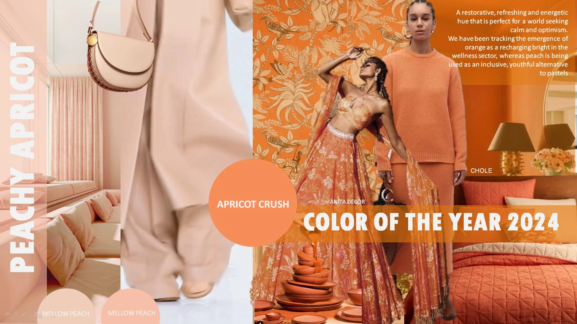
A restorative, refreshing and energetic hue that is perfect for a world seeking calm and optimism. We have been tracking the emergence of orange as a recharging bright in the wellness sector, whereas peach is being used as an inclusive, youthful alternative to pastels. And apricot crush will be the colour of 2024
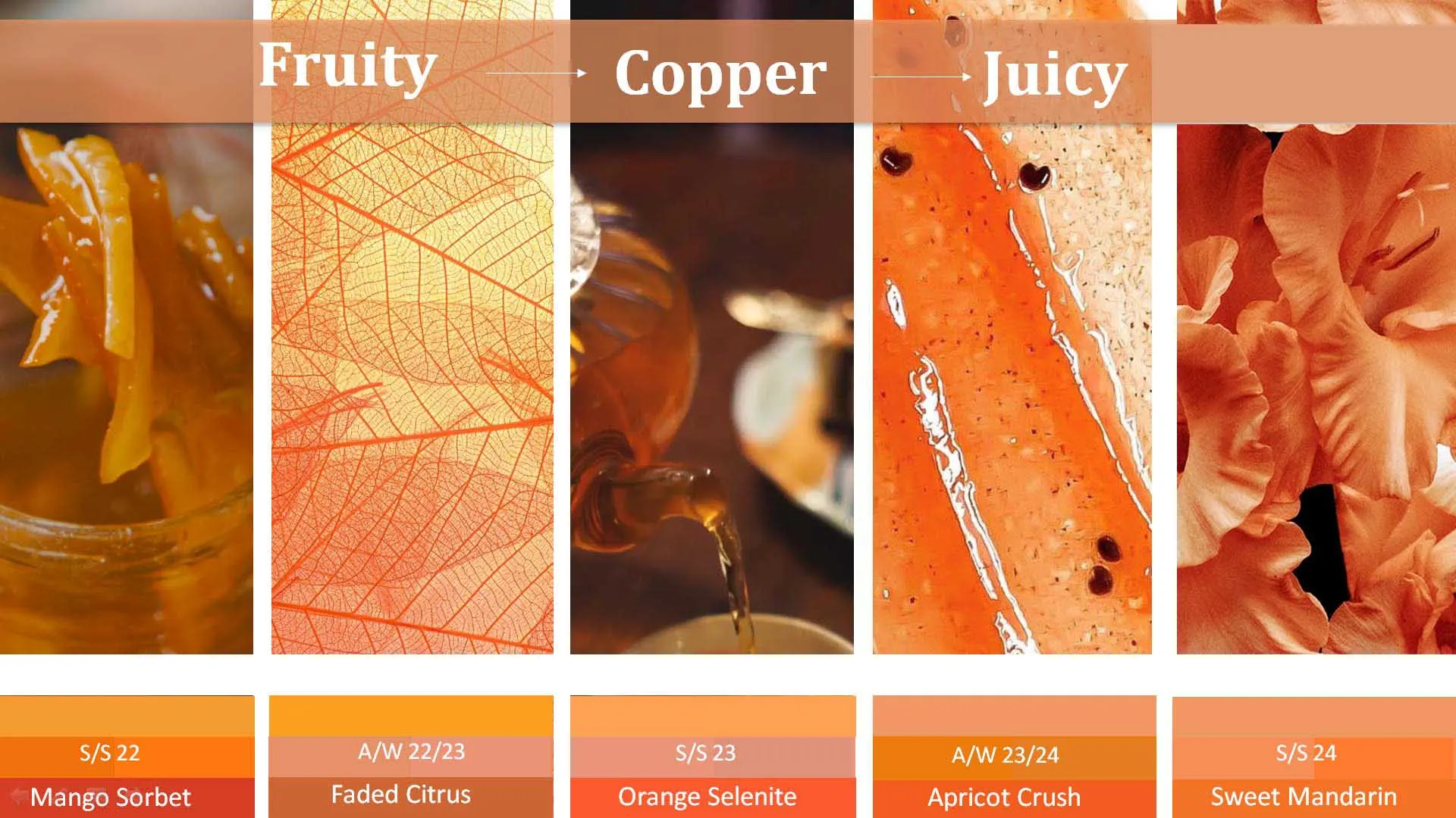
Orange becomes saturated and provides a much-needed energy boost. The juicy tone of Mango Sorbet is accompanied by chromatic Magma Orange evolve into desaturated copper tones. And Orange will be balanced and bright later it’s joined by the bolder and more chromatic orange of Sweet Mandarin
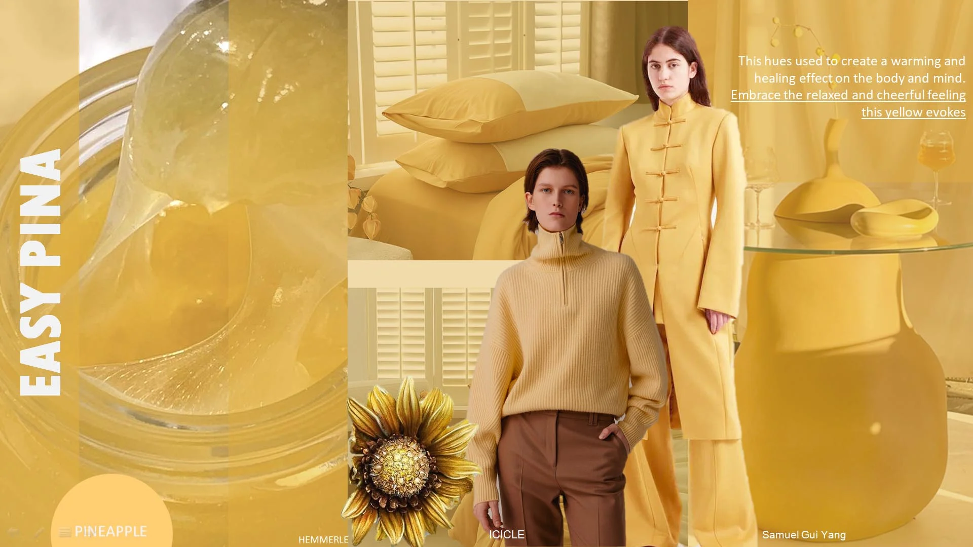
Easy pina is a hue used to create a warming and healing effect on the body and mind. Embrace the relaxed and cheerful feeling this pineapple yellow evokes.
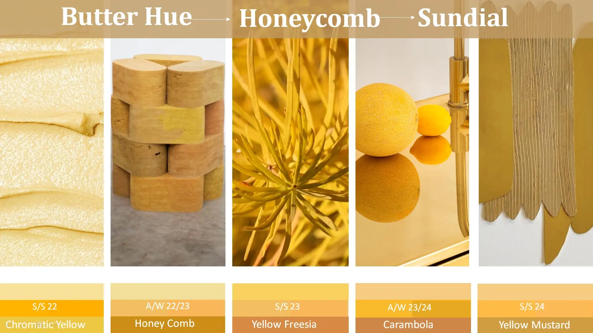
Yellows return with the softer, mellow hue of Butter carries forward, and Honeycomb signal the return of warmer golden yellows. Warm hues continue into 2023 and pairs with the ochre tone of Sundial. Yellow will appear cooler and grounded in ss/24 Pineapple returns, accompanied by chromatic Golden Cob. Yellow Mustard , is the greenest and earthiest of the three yellows this season.


